SSP: HSBC Layout Experimentation
Posted: February 19, 2016 Filed under: Field Y3, Student Set Project, Year 3 | Tags: app, application, cardiff, concept, creative, curiosity, design, exploration, finance, generation, graphics, HSBC, idea, information, layout, management, mobile, mortgage, project, research, responsive, review, set, sketches, student, undergraduate Leave a comment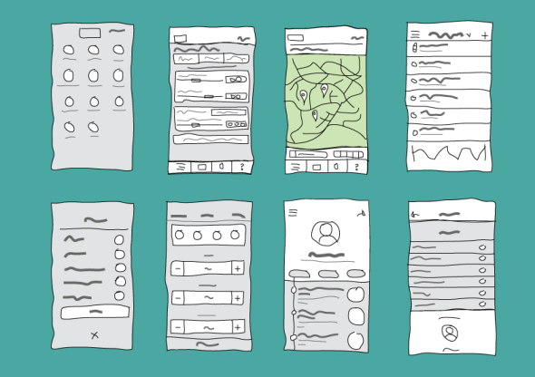 I decided to look at other app layouts for inspiration to help me create a simplistic and efficient layout for my concept. I sketches out many layouts by combining different aspects of the researched apps to create a hybrid design. Although at this time, there is no brand or layout consistency as I wanted to experiment with different possibilities and ways to display the pages. From here I will select which layouts I prefer most and begin creating a fixed layout which will carry the brand identity and allow the app to flow efficiently. I am interested in creating a social aspect to my concept which will allow others in a similar position to share their experiences with friends and family, or possibly other first time buyers while still keeping the users information such as finance and location, safe and secure.
The main features I am curious in designing are the in-app savings account for a mortgage in which the customer can deposit from other HSBC accounts to keep their savings separate from their everyday accounts. I am also very intrigued to research and conceptualise a way to easily view the progress of an outstanding mortgage application, modify or add other users to the application in which they can view, edit or deposit to the mortgage, these functions will be managed by the sole account holder of the mortgage. This concept functions to add family members or partners onto the mortgage application to proof-read, edit and contribute to the funding of a mortgage. Bringing the traditional idea of a mortgage and turning it digital is an exciting prospect and I am super excited to see its development over the next few weeks.
SSP: App Functionality Research
Posted: February 19, 2016 Filed under: Field Y3, Student Set Project, Year 3 | Tags: airbnb, art, brief, cardiff, design, final, graphics, HSBC, information, inspiration, project, research, review, student, uber Leave a commentTo begin my thorough research into this project I want to look at app functionality and successful mega-trend applications. What makes their layout and UX work? how have they incorporated imagery, videos, sound etc. By researching this, I can use the information to create an application that is user friendly. To begin, I wanted to look at Airbnb and Uber which are mentioned in the HSBC brief as ‘market-changing’ concepts. Personally I have never used these, however Uber is being brought to Cardiff in response to the poor taxi service current black cabs offer, although they have improved vastly since more and more take to social media to shame those who refuse service.
Looking at Airbnb:
Airbnb has been hugely successful with providing accommodation across 190 countries. It continues to be one of the largest players in the market and is increasingly growing due to its relentless focus on design, usability and booking efficiency. The concept is very simple, it is a peer-to-peer accommodation rental service offered through cloud technology. It is more authentic than well-established companies such as Travelodge or Premier Inn who can be very expensive depending on the date and location. Guests get double the space they find at hotels for the same price and the service is often perceived as high value. The ‘sharing economy’ has become a mainstream concept to put buyers and sellers together, this was first used by eBay and then followed by Gumtree. This can also be seen on business investment sites such as Kickstarter.
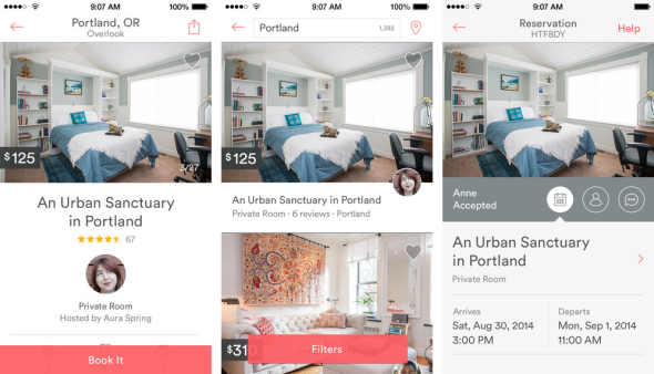
The mobile app itself uses a simple and minimal use of colours within its brand identity. Its use of iconography again follow the brand visual. The app also brings a sense of community to it by including the profile of the host and the reviews per room. There is user customisation through the use of filters, location and booking page. The app also allows user communication to insure a present relationship within the sharing economy. The main structure of user accessibility is on the top bar which leaves the rest cluster-free for a larger user experience while browsing for accommodation.


Airbnb’s recent rebranding brought beautiful typography and simplicity to their logo, website layout and phone app. It confined its wide range of colours/ shades and made the transition from serif to san-serif to meet the expectation and online design trends of the modern day. This gives it a more friendly and less corporate theme. Its unique logo is now easily recognisable due to its simplicity and subtly use throughout their brand awareness. What I notice most is the use of negative space to reveal the powerful imagery which conveys a sense of adventure and inspires curiosity within the user.
Looking at Uber:
Uber again uses the same sharing economy trend to give users the ability to share rides with other users. This in turn means cheaper fares and possibly a more pleasant journey.


Uber’s website uses a limited selection of colours for its brand identity and carefully uses negative space and fantastic hierarchy of text to give the content a visually stunning appearance with a warm, friendly tone. The first page actually uses a video to capture the emotion and atmosphere of the user experience. My favourite part of the Uber website is the parradox-styled transition between each scrollable page, as the text transitions the geometric imagery on the mobile device simultaneously changes. This is a really engaging niche to show the narrative of the service in a visual way.
Real World Project: Climate Change – Concept Construction
Posted: October 14, 2015 Filed under: Real World Project, Subject Y3, Year 3 | Tags: appliances, change, climate, concept, construction, consumption, ideas, infographic, information, interactive, pack, points, project, proposed, real, students, target, touch, tutor, World Leave a commentToday we shared our proposed idea with our tutor during a group meeting. In a short period our concept began to take shape. We want an action based concept which our target audience can interact with to make them aware of their consumption within the household. We quickly made the connection to the welcome packs first year get when moving into halls. This is a small box with a free internet cable, drink and a sim card along with other small useful items. This connection was a great idea as it helped us to shape our 6 steps into something that can be given away in packs.
Our shifting concept now targets upcoming & current students who are moving into student and private housing. This is usually from 2nd year. We feel that targeting this audience is a helpful way to reassure tenants that is is easy to cut their energy bills and help reduce emissions and consumption from within their own household. Our touch points will highlight the major appliances and raise awareness of turning lights off and minimising the use of central heating.
Possible touch points:
Time spent in shower, use of central heating, kettle and oven. We also feel that car sharing is an important factor to raise awareness and promote to reduce emissions.
This package could take the approach of a recycled-material box which could fold down into something useful in a student household. Or the package could replicate IKEA’s minimalistic flatpack to reduce packaging waste and have an appealing identity which may attract a bigger target audience.
Included in the pack would be a set of factual cards with helpful information on the reverse side &/or a leaflet with instructions on how to reduce their carbon footprint. Possibly in the style of a game or infographic. By making connections to objects we are able to have light-hearted humour with an overall sense of the wider issue concerning climate change.

We have started to map out our version of the brief and how we can translate that into our concept. Today we also started playing on food-related puns which have a light hearted approach on locally-sourced food and food wastage.
My Résumé and Cover Letter design
Posted: May 12, 2015 Filed under: Subject Y2, Year 2 | Tags: branding, consumerism, contact, creative, css, cv, design, designer, development, digital, employment, experience, feedback, html, icons, in-house, information, internship, jobs, logo, margin, marketing, menu, original, pdf, portfolio, presence, professional, profile, promotion, resume, seeking, self, social, student, success, undergraduate, unemployed, web, website, work Leave a commentOn the weekend I began redesigning my CV and cover letter to have a unique colour swatch which linked to the theme of my online portfolio. I used a turquoise and grey contrast as they are soft colours and stand out from the universal use of black. More deeply, the psychology of colours suggest that blue is the colour of integrity and loyalty, and green is the colour of growth and balance. I began by creating a margin, I felt that 1/4 of the page was adequate, after creating a dividing line I brought the section inwards to make room for a margin around the page. Once this was correctly proportioned I began adding in title blocks and example text, at this point the framework started to take shape. The next creative things to add were the icons. I found a free retina icon pack online (here) and started to adapt the selected ones to fit my theme. I changed their colour and added a circle icon behind. I made sure they had equal spacing and began positioning them within the margin. Half way through I realised my grids / ruler lines got out of control.


Next was to add the important stuff! I was stuck for my profile as I wanted to make it original yet bursting with strong positive information about myself as a designer. I did not want the cliche ‘my name is..i’m a graphic designer..’ and so by having my name and profession as the page header it shows my creative ability in the simplest form. In the margin I decided to add short bits of information such as my website, contact details and location. I also recreated my cover letter for an example company. The cover letter follows my résumé layout and continues the top margin line in which the company’s address details sits above, to separate it from my own. I am happy with how they have turned out – I will get feedback on them Thursday.
Digital Me
Posted: May 10, 2015 Filed under: Subject Y2, Year 2 | Tags: comparing, cv, digital, domain, exercise, experimentation, friendly, information, job, me, online, passionate, portfolio, presence, resume, review, undergraduate, user, work Leave a commentThis is my final project and so far it has been great! It has given me the time I need to revise my older projects from year 2 and improve them to the best of my ability before my exhibition at the end of the term. This project will take me through the process of refining my online presence and help me to create a professional appearance. I have started my Graphic Design Resume and my online portfolio after a tutorial with Paul last week. I have dramatically changed my approach to a conventional letter and introduction as these are the standard, and I don’t want to be ‘just another designer looking for a job’. I found this most difficult as I was brought up and taught how a formal letter must be approached. However a designer can be formal but in an informal way, expanding on this- when writing a cover letter or introduction, you want to add personality to the information to express your character and create personal connections to the reader. ‘Hi Jane’ is perfectly fine and well-suited for a cover letter in contrast to ‘Dear J Williams’ which feels cold and disconnected from the humanistic behaviour.
Matt’s workshop was really useful and gave me an insight into how online portfolios take unique approaches to find their niche for their specific markets. Looking at other portfolios online put into perspective everything that we had learnt from this exercise. In continuation of this project I will consider my tone of voice when writing.
Company Questions
Posted: April 4, 2015 Filed under: Subject Y2, Year 2 | Tags: budget, cardiff, charity, client, cold, communication, company, email, help, homeless, homelessness, ignored, information, invisible, issues, life, oxfam, problems, research, shelters, sourced, story, streets, volenteering Leave a comment1. What do you want to achieve?
If there are several aims, try to place them in order of importance.
Oxfam want to highlight the issue of poverty and homelessness within Cardiff. This minority are ignored on a daily basis within the streets of Cardiff which may lead to mental health problems and later alcohol and drug abuse. Oxfam would like to grasp the public’s attention on this issue within their day-to-day activities. A very few percentage of the public pay any attention, and even less give the minority group any change. Instead, people would rather pay for a tea or coffee in a cafe which is 100x more expensive than one at home. Oxfam would like to investigate this behaviour and how it can be adapted for a better cause. Oxfam have also come across many small-time companies which do a ‘pay-it-forward’ scheme whereby the customer can put money forward for a meal for the homeless.
2. What single thought would we like to leave the audience with after they receive this work?
Does the client want people to feel angry, or saddened, or amused. How does the client want people to act – e.g. by spreading the message amongst friends, acquaintances and family, making a donation or contacting the organisation for further information, or lobbying politicians?
Oxfam would like the audience to become more aware of this issue which is very local which in turn may increase the chances of volunteers, local charity work and fundraising. private donations would also be a great response from this non-profitable awareness scheme.
3. What do we know about the audience, recipient, consumers, their feelings and thoughts?
Try to find out as much information as possible.
Is it possible to develop a persona?
The audience ranges from all ages. Many people are oblivious to the issues around them as many are submerged within social media and consumerism, which fall below an individuals threshold for conscious perception.
4. What is the message? Help them sum it up in one sentence.
If there is more than one message, discuss their priority.
Poverty is all around us, even if its not as easily recognisable with 1 in 8 people unable to pay their bills on time. Whats more important, a quick coffee which will satisfy you for an hr, or a charitable donation which may improve someones lifestyle indefinitely.
The Real and Virtual Internet Of Things: Session 2
Posted: January 22, 2015 Filed under: Field Y2, Year 2 | Tags: 3d, augmented, bot, coding, command, information, pi, printing, python, raspberry, reality, recording, scanning, scripting, sensors, technology Leave a commentToday we looked at the Raspberry Pi and a brief insight to Python coding. I had previous bought 2 Raspberry Pi’s when they first came out so I had some basic knowledge of how they worked and I had previously worked on some coding to customise it for my own application which was a fantastic experience. Working with this today made me realise how far the Raspberry Pi’s have come and how they have been used since their release 4 years ago. After looking at the device I worked on my idea generation for my final idea concept. I wanted to work with augmented reality to create some sort of educational poster which could be interacted via a handheld device to overlay videos or images as well as information. I felt it would have been a great idea to integrate a multi choice quiz game which over-layed a diagram of a heart, and as each question was answered the augmented visuals would advance to explain and quiz the next stage of each chamber and how they work. This type of work is professionally known as medical illustration and design which after some research is a very qualified job to get into with would help a huge amount of people and be financially beneficial to me. The NHS activity seeks designers for this position and I even discovered that NatWest offers bursaries to university courses after your degree to help you advance your capabilities in this sector. I will bare this in mind and so more research, but I think this would be a fantastic opportunity
Final Piece: Research and Development
Posted: June 7, 2014 Filed under: Subject | Tags: 2014, a-z, alignment, bagc, book, cardiff, cards, communication, cyan, development, dictionary, experiences, final, graphic, information, kerning, met, one, piece, reflection, research, sleeve, subject, typeface, uwic, year 1 Leave a commentHere is my A-Z Research and Development PDF. It shows my journey through my progression of making the final outcome.
Conclusion of Final Outcome.
I am satisfied with its appearance and final format after many prototypes and hours of digital design. I decided to change my format from a book to a deck of cards because I felt that the book was a cliché for personal experiences and for others to get information. Instead I chose to take the style of a business card but slightly larger to fit but small enough to fit into the palm of my hand. I thought about how I was going to bind them together, one idea was to stitch them, but instead I kept them loose and made a sleeve for them to fit in. This also presents a connotation of each experience being different from the last. I chose to do an experience dictionary after looking at how information we take for granted is presented in every day life. I took the same approach to presenting information by having a list effect, this is an easy-to-read layout. I also added what type of experience it was whether it was a skill, workshop or lecture. To keep the cards interesting I added a large typeface to easily identify which letter the reader is currently on, beyond that it also takes the form of a specific typeface beginning with that letter, this is credited below each large letter. I also chose to add colour to my cards to give it a more inviting appearance instead of a cold, black theme. The base typeface used is Baskerville as I wanted it to have a traditional value towards information, it also helps with reading as the serifs create a clear baseline. I left negative space at the top of each card as this is where the cards will be used most when they are picked out of the pile, keeping the information clear from marks and obstruction. On the back of each card there is also my own personal experience to each of the sections of the course. These are not immediately noticeable as I did not want my personal views on the course to influence the reader, I wanted them to make their own thoughts before they read mine.
My Final A-Z Outcome ‘ My Experonary” (The Experience Dictionary of BAGC Y1)
Posted: June 3, 2014 Filed under: Subject, Term 3 | Tags: a7, advice, bagc, berlin, cardiff, cards, collaboration, constellation, dictionary, experiences, final, graphics, group, information, met, outcome, project, reflection, sleeve, subject, trips, work, workshops, year 1 2 CommentsI am pleased with my final outcome for year 1 BAGC. I have enjoyed making this and have surprised myself at how formal the sleeve and cards look without the black grids. I have adjusted the alignment of the text and adjusted the kerning. By changing the repeated typeface on the right of each card, I have instead changed the typeface to correspond with one that starts with the specific letter, eg. T – Times New Roman. I then labeled these clearly underneath or to the side. My one regret is not chaining the typeface colour to cyan to match the title colour. This would add consistency and balance the cards out (but its not to late! I may change this before the deadline). Hidden under the flap is my blog url for the first years to explore if they wish. Finally, I added a content card at the start with shows the audience which letters have been chosen as not all have been done, otherwise this may have caused confusion. I also added an end card with my letterpress outcome from term 1, this promotes my blog in a traditional and inspirational way – on the back of that card I have added an informal message thanking the audience for reading my personal experiences of year 1 and invite them to say hello. I hope this will end my experiences with a friendly close.


Recent Comments