Revisiting my portfolio
Posted: March 22, 2016 Filed under: Field Y3, Year 3 | Tags: branding, briefs, cardiff, clients, design, graphic, hire, HSBC, jobs, live, me, portfolio, projects, revisiting, undergraduate, work Leave a commentOver Easter I want to revisit my third year portfolio to help me after graduation when applying to the industry. I have been productive by getting up early the past few days to get on with my work. I really like the progress I have been making and hope I can continue this over my days off. I want my portfolio to be A4 size as it is easy to store away in a bag during interviews. I hope to get this printed and bound when I am back in university after the holidays. I want to use a range of vibrant colours to draw attention to different elements of my work without it being over dramatic. I will experiment around and see what works best. It would also be visually engaging if I can take photos of my physical pieces with content such as coffee beans for the UCC Coffee project so that the mockups are not flat and generic.

Digital Me: Mock-up
Posted: May 13, 2015 Filed under: Subject Y2, Year 2 | Tags: business, card, cover, cv, design, designer, digital, experience, graphics, hire, internship, jobs, layout, letter, me, mock, networking, portfolio, presence, project, promotion, resume, student, unemployed, up, wanted, work Leave a comment
Today I’ve spent the day making minor adjustments to my layout design and creating my business card. I wanted to capture these in context and so I thought I would make a mock-up to included everything to size. My printer loves to print my colour theme as blue and so seeing its true colour makes it worthwhile. I have shared this on my Facebook and Twitter accounts as part of my digital presence. In return a few design companies have started following me.
Résumé and Cover Letter Design Preview
Posted: May 12, 2015 Filed under: Subject Y2, Year 2 | Tags: cover, css, cv, design, designer, employment, experience, hire, html, internship, job, jobs, letter, marketing, me, preview, resume, social, student, unemployed, wanted, wed, work Leave a comment
Here is a preview of my résumé (above) and cover letter (below). From the two images you can see the similar colour theme and use of icons and top margin separator.

Digital Me
Posted: May 10, 2015 Filed under: Subject Y2, Year 2 | Tags: comparing, cv, digital, domain, exercise, experimentation, friendly, information, job, me, online, passionate, portfolio, presence, resume, review, undergraduate, user, work Leave a commentThis is my final project and so far it has been great! It has given me the time I need to revise my older projects from year 2 and improve them to the best of my ability before my exhibition at the end of the term. This project will take me through the process of refining my online presence and help me to create a professional appearance. I have started my Graphic Design Resume and my online portfolio after a tutorial with Paul last week. I have dramatically changed my approach to a conventional letter and introduction as these are the standard, and I don’t want to be ‘just another designer looking for a job’. I found this most difficult as I was brought up and taught how a formal letter must be approached. However a designer can be formal but in an informal way, expanding on this- when writing a cover letter or introduction, you want to add personality to the information to express your character and create personal connections to the reader. ‘Hi Jane’ is perfectly fine and well-suited for a cover letter in contrast to ‘Dear J Williams’ which feels cold and disconnected from the humanistic behaviour.
Matt’s workshop was really useful and gave me an insight into how online portfolios take unique approaches to find their niche for their specific markets. Looking at other portfolios online put into perspective everything that we had learnt from this exercise. In continuation of this project I will consider my tone of voice when writing.
My Kinetic Typography Experimentation
Posted: May 10, 2014 Filed under: Subject, Term 3 | Tags: about, action, after, back, bagc, effects, experimentation, kinetic, look, me, movement, review, subject, type, typography, uwic, words 1 CommentWe were given the brief of making a Kinetic Typography video using After Effects. The purpose of this was to express our ability with the software and improve our skills with some of the tools available. I used graphics which I created on Illustrator and Photoshop and imported them into the video. This allowed me to create PNG files such as the dirty plates and road signs. I really enjoy creating Motion Graphics and will continue to experiment with this style for future projects.
Stopmotion: a slow beginning
Posted: November 26, 2013 Filed under: Format, Subject, Term 1 | Tags: deadline, drawing, duration, frames, help, istopmotion, joke, long, me, motion, pencil, process, slow, stop, time, triangle Leave a comment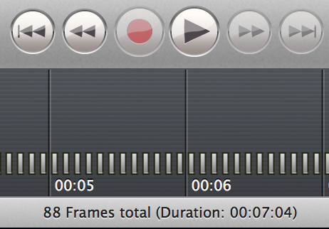
To start the project of a moving image I want to draw out each frame of my animation and put them together in iStopmotion then transfer it to iMovie to add sound effects. So far I have done 88 frames which has taken almost all day to do as the software is new to me, hopefully I will pick it up quickly and get to my 2minute mark by the deadline!

Recent Comments