UCC Coffee: Tray liner/ poster
Posted: November 24, 2015 Filed under: competitions, Subject Y3, Year 3 | Tags: aspet, award, awareness, blend, cafe, certified, coffee, competition, concept, designer, eco-friendly, ethical, fair, farmers, fresh, grand, graphics, group, hierarchy, history, human, illustration, layout, liner, origins, poster, promotion, quality, rebrand, recycled, reimagined, revitalisation, roasted, slow, student, sustainable, traceable, trade, tray, UCC Coffee, YCN Leave a commentAfter researching different points of contact the consumer has with the product, I thought of traditional forms of communication and advertisement within a café. Often consumers buy food in cafés which may be accompanied by a unique UCC Coffee blend. This would be placed on a tray and then carried to the table. I was inspired by fast food restaurants, e.g. McDonalds – with their tray liner and decided to explore the possibilities of using this liner to advertise each unique blend UCC have to offer. I began by drawing out a basic layout and played with the hierarchy of text and image placement. I was excited to dive straight into digital exploration and initially designed four liner posters with high quality coffee-related stock images. Upon completion I really liked the outcome however I felt this did not respectfully contribute to the brief as it did not raise awareness to the ethical and fair-trade qualities off UCC Coffee. I redeveloped these liner posters with images of photos of coffee farmers from the origins of which the individual blend was harvested, e.g. Brazil & Peru.
Note: Sources of the images are credited at bottom of post.


The ethical aspect of these liner posters bring awareness to the people who work hard to make UCC Coffee possible. The layout of the text is set on the left side of each poster with the corresponding coffee farmer within the negative space. This information-free zone brings importance to the human aspect and quality of delivering fairer coffee beans to you, the consumer. These will be printed onto recycled materials with eco-friendly ink to help promote sustainability in the process.

These posters also have the possibility of bringing deals and statistics of ethical trade from UCC to again highlight the positive effects of drinking UCC Coffee.


Digital Me: Mock-up
Posted: May 13, 2015 Filed under: Subject Y2, Year 2 | Tags: business, card, cover, cv, design, designer, digital, experience, graphics, hire, internship, jobs, layout, letter, me, mock, networking, portfolio, presence, project, promotion, resume, student, unemployed, up, wanted, work Leave a comment
Today I’ve spent the day making minor adjustments to my layout design and creating my business card. I wanted to capture these in context and so I thought I would make a mock-up to included everything to size. My printer loves to print my colour theme as blue and so seeing its true colour makes it worthwhile. I have shared this on my Facebook and Twitter accounts as part of my digital presence. In return a few design companies have started following me.
Self Promotion Business Cards
Posted: May 13, 2015 Filed under: Subject Y2, Year 2 | Tags: brand, branding, business, cards, collaboration, creative, cv, designer, employment, internship, job, minimalistic, portfolio, presence, promotion, resume, self, student, studio, team, unemployed, visual, wanted 1 Comment
I quickly put a business card together earlier and printed it onto card, again I have kept the same colour theme constant throughout. On the back of the card there are 3 icons showing a cup, pen and light bulb. These represent a light-hearted transition from coffee > brain-storming > ideas. The original plan was to have the back of the card in colour and the icons white to contrast against the front. However I have better things to splash my ink on and so I swapped this around and made the icons have colour instead. I think this minimalistic approach still has a lasting impression on the viewer.
Self Promotion Stickers
Posted: May 13, 2015 Filed under: Subject Y2, Year 2 | Tags: company, cover, cv, designer, digital, domain, employment, internship, jobs, letter, presence, professional, promotion, resume, self, stickers, student, unemployed, wanted, website Leave a comment

I thought I would spice things up and make a few stickers to promote myself and my new website. They are 38mm in diameter so manipulating the text to be readable was a task. I feel my stickers are a little top heavy but drawing the attention above the centre point is more pleasant on the eyes. I have reused the same colour theme throughout my website, résumé, cover letter, Facebook & Twitter and stickers. I hope to create a business card too! My designer presence is doing it’s best!
My Résumé and Cover Letter design
Posted: May 12, 2015 Filed under: Subject Y2, Year 2 | Tags: branding, consumerism, contact, creative, css, cv, design, designer, development, digital, employment, experience, feedback, html, icons, in-house, information, internship, jobs, logo, margin, marketing, menu, original, pdf, portfolio, presence, professional, profile, promotion, resume, seeking, self, social, student, success, undergraduate, unemployed, web, website, work Leave a commentOn the weekend I began redesigning my CV and cover letter to have a unique colour swatch which linked to the theme of my online portfolio. I used a turquoise and grey contrast as they are soft colours and stand out from the universal use of black. More deeply, the psychology of colours suggest that blue is the colour of integrity and loyalty, and green is the colour of growth and balance. I began by creating a margin, I felt that 1/4 of the page was adequate, after creating a dividing line I brought the section inwards to make room for a margin around the page. Once this was correctly proportioned I began adding in title blocks and example text, at this point the framework started to take shape. The next creative things to add were the icons. I found a free retina icon pack online (here) and started to adapt the selected ones to fit my theme. I changed their colour and added a circle icon behind. I made sure they had equal spacing and began positioning them within the margin. Half way through I realised my grids / ruler lines got out of control.


Next was to add the important stuff! I was stuck for my profile as I wanted to make it original yet bursting with strong positive information about myself as a designer. I did not want the cliche ‘my name is..i’m a graphic designer..’ and so by having my name and profession as the page header it shows my creative ability in the simplest form. In the margin I decided to add short bits of information such as my website, contact details and location. I also recreated my cover letter for an example company. The cover letter follows my résumé layout and continues the top margin line in which the company’s address details sits above, to separate it from my own. I am happy with how they have turned out – I will get feedback on them Thursday.
Online Presence | Portfolio
Posted: May 10, 2015 Filed under: Subject Y2, Year 2 | Tags: Ben, clean, company, contact, cv, design, designer, development, digital, domain, engage, experience, facebook, follow, freelance, fresh, friendly, interactive, internship, live, media, minimalistic, networking, newbie, online, passionate, playful, portfolio, presence, preview, promotion, response, resume, social, start-up, testimonial, walton, web, website, work Leave a commentRecently, I have started to work on my online presence. I bought a domain and set up a website with the basics. I also created a Facebook page to engage people on social media to visit my website and stay updated on my journey. I still need to add work to my portfolio and Facebook site, however the structure is now in place for me to do this. My online portfolio will be live at www.imben.co.uk. Check it out today and watch it develop over the next few weeks. My cv/résumé has also been in the works too!


Visualisation Workshop with Neil Angove
Posted: October 2, 2014 Filed under: Subject Y2, Year 2 | Tags: angove, apps, cmyk, colour, consistency, consortium, contextual, creative, creativity, europe, FOGRA39, hierarchy, icc, indesign, international, ISO, logo, neil, pantone, point, prepress, profile, promotion, rgb, size, suit, visualisation, workshop Leave a comment“We design to promote human welfare, not to sell a product”
We must keep a consistency of house-style. This relates to the colour scheme, words used and how they are treated, also the words in terms of the language, customer service, materials and services used..etc
Contextual Creativity
IOTasphere – internet of things and its connections to you and your device.
ICC Profile – International Colour Consortium. This keeps your European colours correct over software and computers.
Positioning things on a page requires co-ordinates through the x + y axis. Never position by eye.
Remember Typographic Hierarchy
A Point size – an inch / 72 = point size
9-12 point size for body text is the general rule.
Always begin at the end – The person receiving the message.
Constrained by contextual creativity. You will always be limited by the software available to you.
Keep a device profile.
Pantone, CMYK, RGB, HTML
(cards, letters), (Pictures), (apps), (apps, websites)
ICC Profile changes the dot sizes by 15% so when it hits the paper and is absorbed it expands back by the 15% to the original screen size.
ADOBE Bridge will auto-setup
Always create 3 logos, Pantone, CMYK, RGB
notes:
Edit > creative suit colour settings > Europe Prepress 3 // sorts out ICC information and profiles
Edit > convert to profile // This converts RGB to CMYK through FOGRA39 ISO.
Looking at the shop signs in Castle Arcade
Posted: March 18, 2014 Filed under: Field | Tags: advert, appealing, arcade, castle, express, pizza, promotion, rectangular, signs, traditional, wooden Leave a comment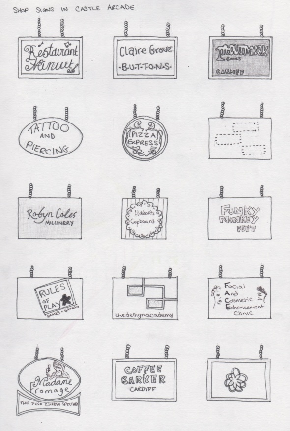
I wanted to compare the different shop signs throughout the arcade and see how they differ to relate to their shops theme. Most of them stick to the traditional rectangular sign, while Pizza Express and a more qwerky shop have chosen to downsize their signs to a circle and a square made from pallet boards.
Castle Arcade Map
Posted: March 18, 2014 Filed under: Field | Tags: arcade, architecture, campaign, castle, competition, design, in, map, marketing, promotion, research, shops Leave a comment
A map to show which shops are in competition with each other and their location within the Castle Arcade

Recent Comments