Business Cards
Posted: April 20, 2016 Filed under: Subject Y3, Year 3 | Tags: business, cardiff, cards, china, CSAD, degree, designer, exhibition, final, graduation, graphic, identity, industry, internship, metropolitan, notice, open, public, show, students, undergraduate, university, ux, visit, visual Leave a comment
Today I made some improvements to my business cards and sent them off to be printed. I have added curved edges and a matte finish on 350gsm card. I made changes to the front which included taking away the program icons and adding my location along with symbols for the email, phone and location. I also adjusted the text sizes between my industry title and contact information. On the reverse side I have created a range of new hand illustrated icons to copy across the same style of pattern I created for my UCC Coffee project, which I will be exhibiting for my degree show. I have ordered 50 business cards which should be enough for my degree show.
Blog shoutout for Isa
Posted: April 19, 2016 Filed under: Other | Tags: blog, brazilian, coffee, communication, designer, follow, graphics, green card, illustration, inspiration, international, kebab, shoutout, stalker, traveller, vectors, World, world traveller Leave a comment
See what Isabela is up to in her final year of university below;
https://isabelaassiria.wordpress.com
Business Cards
Posted: April 18, 2016 Filed under: Subject Y3, Year 3 | Tags: behance, buisness, cards, cartoon, character, designer, drawing, graphic, illustration, internship, job, personal, portfolio, rebrand, revisit, toon, undergraduate, upcoming, vector 1 CommentIt’s almost a year to the day when I created my self identity in the design world through my website, Facebook page, business cards and stickers. However I did not keep them updated which has left them go unnoticed. My plan is to revisit each of these after my final submission and make a real chance for myself to get noticed within the industry. I want to set up my own Behance portfolio as I can see and get feedback from other creatives super easy. I have my own website which has my portfolio stuff on which I will also update to act as a landing page. I feel my custom URL will be more memorable than a default set URL from behance for instance, making it easier for people to remember me. So, 1 year later and I am once again re-imaging myself as a near-graduate designer. 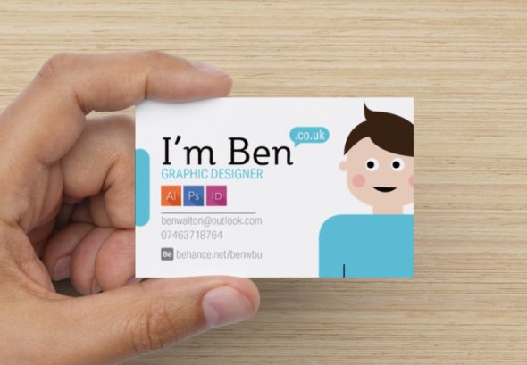
I have kept the front facing card clean and have tried to not overload it with information. I feel the information anyone would need is on there and so I do not need to list every site I am attached to. It starts with a friendly typeface with smooth curves which says I’m Ben – pretty straightforward, it then goes on to turn into a URL address with a simple speech bubble. It states my sector, a few of the programs I am familiar with which are the key programs to most simple design jobs. Next is my email, phone number and behance url for a recognisable portfolio site. As for the back of the card, I did not have any more information I felt was necessary and so I included a friendly message to the person I hand the card to, or to whomever picks my business card up.

This vibrant colour contrast is very hard to miss and having a simple message such as this being handed to you after a first encounter personally is a nice touch. The colours used throughout are pale palette tones which complement each other. I will get feedback on these before sending them off for printing in the next few days so they arrive in time for my exhibition.
An unusual break from dissertation
Posted: January 7, 2016 Filed under: Dissertation, Year 3 | Tags: basic, beginner, benefit, chengdu, china, chinese, culture, designer, dissertation, experience, graduation, graphic, graphics, greeting, helpful, internations, internship, job, junior, language, learner, learning, mandarin, phonetics, pinyin, procrastination, student, summer, tones, writing Leave a commentNí haū, wō shî Ben.
你 花, 我 实 本
Today, I’ve spent my time learning basic mandarin and  feel like I now have a better understanding of tone alternations. The language itself is not as hard as I had expected – with no past tense vocabulary, gender or rearranged sentence structure. I have been writing out basic sentences in Pinyin form such as:
who I am, where I am from, what languages I can speak, my age, family members, pets and food.
I have used resources online and a book I bought for beginners which has been a real help and easy to follow. I thought it would be a great opportunity to learn some basic sentences before I go to China in August. This will be a great help when commuting and ordering food, and also entertaining the locals.
I will be posting my learning progress as I go along in the coming weeks and will eventually add a new menu tab for my China experience. This will be for me to keep a daily note of the culture, different activities I do and some internship-related work too!
Zài jiàn.
UCC Coffee: Tray liner/ poster
Posted: November 24, 2015 Filed under: competitions, Subject Y3, Year 3 | Tags: aspet, award, awareness, blend, cafe, certified, coffee, competition, concept, designer, eco-friendly, ethical, fair, farmers, fresh, grand, graphics, group, hierarchy, history, human, illustration, layout, liner, origins, poster, promotion, quality, rebrand, recycled, reimagined, revitalisation, roasted, slow, student, sustainable, traceable, trade, tray, UCC Coffee, YCN Leave a commentAfter researching different points of contact the consumer has with the product, I thought of traditional forms of communication and advertisement within a café. Often consumers buy food in cafés which may be accompanied by a unique UCC Coffee blend. This would be placed on a tray and then carried to the table. I was inspired by fast food restaurants, e.g. McDonalds – with their tray liner and decided to explore the possibilities of using this liner to advertise each unique blend UCC have to offer. I began by drawing out a basic layout and played with the hierarchy of text and image placement. I was excited to dive straight into digital exploration and initially designed four liner posters with high quality coffee-related stock images. Upon completion I really liked the outcome however I felt this did not respectfully contribute to the brief as it did not raise awareness to the ethical and fair-trade qualities off UCC Coffee. I redeveloped these liner posters with images of photos of coffee farmers from the origins of which the individual blend was harvested, e.g. Brazil & Peru.
Note: Sources of the images are credited at bottom of post.


The ethical aspect of these liner posters bring awareness to the people who work hard to make UCC Coffee possible. The layout of the text is set on the left side of each poster with the corresponding coffee farmer within the negative space. This information-free zone brings importance to the human aspect and quality of delivering fairer coffee beans to you, the consumer. These will be printed onto recycled materials with eco-friendly ink to help promote sustainability in the process.

These posters also have the possibility of bringing deals and statistics of ethical trade from UCC to again highlight the positive effects of drinking UCC Coffee.


SUSTAINABOX User Journey
Posted: October 26, 2015 Filed under: Real World Project, Subject Y3, Year 3 | Tags: action, app, application, bills, brand, change, client, climate, concept, consumption, cop21, cymru, cynnal, design, designer, electric, energy, gas, graphics, guidance, houseshare, identity, illustrations, illustrator, progress, project, real, reduce, student, sustain, sustainabox, tips, ux, vector, wales, World Leave a commentMy next section was the user journey of Sustainabox. After drawing up different ways of presenting this I felt that a storyboard would be most suitable. It uses the brand colours & typeface throughout. The storyboard is clean and uncluttered which makes it flow correctly.

Steps:
- The excieted students prepare to move into their first shared household
- They receive their sustainabox upon moving in, from the Student union
- The Sustainabox will include various touch points for them to use
- The students will read the instructions and get involved saving energy
- They will follow touch points such as turing the lights off…
- …And car sharing with friends to university
- The students can put their meter readings into the sustainabox app
- And get helpful data on their energy consumption and tips to save money
- At the end of the month, the students get cheaper bills and save energy! well done!
Tomorrows session we will cover material costs and sustainability for a finance plan. Our final presentation is on Thursday, so it would be great to rehearse this on Tuesday and Wednesday if possible. We have contacted the Student Union to see if they would like to get involved in our project and they replied with a positive attitude towards our concept however they cannot attend our presentation.
Brand World Revisited
Posted: May 27, 2015 Filed under: Subject Y2 | Tags: brand, cause, design, designer, dog, health, icons, identity, merchandise, organisation, recovery, rehabilitation, rescue, symbols, vets, World Leave a comment
On the weekend I finally got around to finishing my Brand World project after my mac broke last year. My brief was to design a brand identity for a company which was chosen for me. I got Hunter Company which was a service animal rehabilitation centre. This company wanted injured or traumatic dogs to be given a second chance at life to be happy. I began by using my previous sketches and turned them into vectors which would resemble the company symbols. I experimented with these and made a collage out of them and tried to make shapes by combining them.

I worked on some of the merchandise by creating a red cross symbol made out of the company symbols to signify the company’s ambitions. I really enjoyed creating these which lead me create a collection of dog food packaging.
International Flag of Planet Earth
Posted: May 20, 2015 Filed under: Research | Tags: animation, connected, conuntries, designer, earth, exploration, flag, fredriksson, info, infograph, international, johan, oskar, pernefeldt, planet, ratio, society, together, united Leave a commentThis infographic video shows how Oskar Pernefeldt’s idea of an international Earth flag would look like. It take in to account the different proportions of continental flags and their ratios. It uses a 2:3 ratio which is the most commonly used flag globally. Designer Johan Fredriksson animates this video beautifully and captures the process using responsive animation. I have been inspired by this video to create a similar styled video in my 3rd year. Working with animation was much different to the usual methods of presenting information and ideas in my first year. I will continue to look into the work of Johan Fredriksson and similar designers.
Digital Me: Mock-up
Posted: May 13, 2015 Filed under: Subject Y2, Year 2 | Tags: business, card, cover, cv, design, designer, digital, experience, graphics, hire, internship, jobs, layout, letter, me, mock, networking, portfolio, presence, project, promotion, resume, student, unemployed, up, wanted, work Leave a comment
Today I’ve spent the day making minor adjustments to my layout design and creating my business card. I wanted to capture these in context and so I thought I would make a mock-up to included everything to size. My printer loves to print my colour theme as blue and so seeing its true colour makes it worthwhile. I have shared this on my Facebook and Twitter accounts as part of my digital presence. In return a few design companies have started following me.
Self Promotion Business Cards
Posted: May 13, 2015 Filed under: Subject Y2, Year 2 | Tags: brand, branding, business, cards, collaboration, creative, cv, designer, employment, internship, job, minimalistic, portfolio, presence, promotion, resume, self, student, studio, team, unemployed, visual, wanted 1 Comment
I quickly put a business card together earlier and printed it onto card, again I have kept the same colour theme constant throughout. On the back of the card there are 3 icons showing a cup, pen and light bulb. These represent a light-hearted transition from coffee > brain-storming > ideas. The original plan was to have the back of the card in colour and the icons white to contrast against the front. However I have better things to splash my ink on and so I swapped this around and made the icons have colour instead. I think this minimalistic approach still has a lasting impression on the viewer.

Recent Comments