Business Cards
Posted: April 18, 2016 Filed under: Subject Y3, Year 3 | Tags: behance, buisness, cards, cartoon, character, designer, drawing, graphic, illustration, internship, job, personal, portfolio, rebrand, revisit, toon, undergraduate, upcoming, vector 1 CommentIt’s almost a year to the day when I created my self identity in the design world through my website, Facebook page, business cards and stickers. However I did not keep them updated which has left them go unnoticed. My plan is to revisit each of these after my final submission and make a real chance for myself to get noticed within the industry. I want to set up my own Behance portfolio as I can see and get feedback from other creatives super easy. I have my own website which has my portfolio stuff on which I will also update to act as a landing page. I feel my custom URL will be more memorable than a default set URL from behance for instance, making it easier for people to remember me. So, 1 year later and I am once again re-imaging myself as a near-graduate designer. 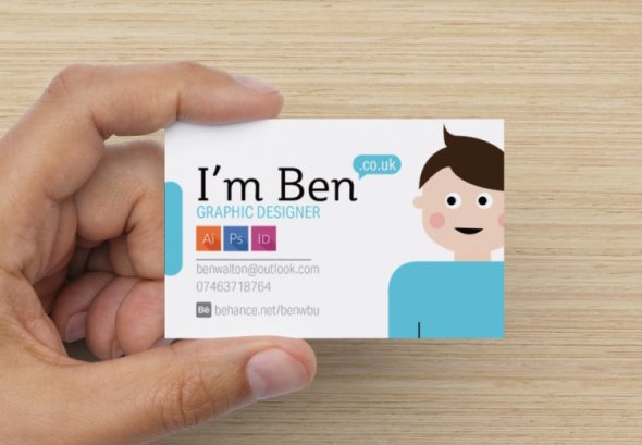
I have kept the front facing card clean and have tried to not overload it with information. I feel the information anyone would need is on there and so I do not need to list every site I am attached to. It starts with a friendly typeface with smooth curves which says I’m Ben – pretty straightforward, it then goes on to turn into a URL address with a simple speech bubble. It states my sector, a few of the programs I am familiar with which are the key programs to most simple design jobs. Next is my email, phone number and behance url for a recognisable portfolio site. As for the back of the card, I did not have any more information I felt was necessary and so I included a friendly message to the person I hand the card to, or to whomever picks my business card up.

This vibrant colour contrast is very hard to miss and having a simple message such as this being handed to you after a first encounter personally is a nice touch. The colours used throughout are pale palette tones which complement each other. I will get feedback on these before sending them off for printing in the next few days so they arrive in time for my exhibition.
Tutorial with Ray: which direction to take
Posted: December 1, 2015 Filed under: competitions, Other, Term 3, Year 3 | Tags: cafe, coffee, consumer, design, ethical, grand, graphics, growth, identity, label, packaging, rebrand, revitalisation, student, sustainable, tutorial, UCC Leave a commentToday I had a quick tutorial with Ray on my progress. I have not done much more since my last tutorial on Friday apart from the changes suggested by my peers due to preparing for an interview which I had this morning at 9am with a company called ‘Buddy Creative’ based in Chengdu, China. I showed him my new possible box concept which features a transparent window shaped in the continent of where the beans originated from. I also showed him a few of my new brand patterns and discussed my brief with him. We both agreed that it would be an option to design a packaging which would be present to a consumer within a shop – as an additional possible touch point.
Ray suggested that I keep to the generic packaging style to keep my brand style on target in time for the hand-in, in 2 weeks time. I feel this is sensible and I will continue to adapt my packaging to fit the briefs goals of promoting what good UCC Coffee is and what good it does.


He also felt that I needed a contrasting set of colours to bring excitement to the brand to grasp the consumers attention in a striking fashion. Ray helped me out a lot by just discussing the direction I could take for Wednesdays tutorial and gave me some possible ways of steering away from the corporate feel of my Grand Café label.
Direction to take:
Following the tutorial, I need to introduce geography and educate the consumer of the source of the coffee beans and how the are ethically farmed.
Tutorial with David
Posted: November 27, 2015 Filed under: competitions, Other, Subject Y3, Year 3 | Tags: coffee, corporate, cup, ethical, feedback, guidance, help, label, pattern, pictograms, promote, rebrand, rethink, revitalisation, sustainability, tutorial, UCC Leave a commentToday, I had a group tutorial with my peers, were went around each unique brief and the progression from each person. From the group discussion, I was suggested to change the typeface as it makes the packaging seem to corporate through the use of sharp and blocky colours.

I originally did this to help reduce trimming wastage during production, however the tutor suggested I ignored the printing aspect of the brief at this stage as it will limit my creative ability. I should think about a different shape for the label, if a label is used at all. Other means of packaging could be through tins, boxes and old shaped containers which resemble the coffee beans origins.


In response to my illustration patterns, the pictograms are interesting and have a unique brand identity – however, the icons are not relevant to the origins or company goals. They are just seen as generic farming icons which could be replicated anywhere. I need to think about this and target more specifically which icons I should illustrated. This could be resolved by maybe adding small continents within the pattern, along with famous landmarks or food to the designated blend.
Onto the further touch points, the cup could have a story on the inside of the cup which is revealed as the user drinks their coffee. Another approach would be to have parts of the story fragmented over multiple cups which may encourage consumers to try other blends. The group suggested that I could look at ‘heat sensitive ink’ for the coffee cups to reveal a story.
Main touchpoints:
To bring the illustrations into the label design, steer away from the corporate typefaces and block colours.
Think about how the story can be told within the café, possibly on the walls.
UCC Coffee: Tray liner/ poster
Posted: November 24, 2015 Filed under: competitions, Subject Y3, Year 3 | Tags: aspet, award, awareness, blend, cafe, certified, coffee, competition, concept, designer, eco-friendly, ethical, fair, farmers, fresh, grand, graphics, group, hierarchy, history, human, illustration, layout, liner, origins, poster, promotion, quality, rebrand, recycled, reimagined, revitalisation, roasted, slow, student, sustainable, traceable, trade, tray, UCC Coffee, YCN Leave a commentAfter researching different points of contact the consumer has with the product, I thought of traditional forms of communication and advertisement within a café. Often consumers buy food in cafés which may be accompanied by a unique UCC Coffee blend. This would be placed on a tray and then carried to the table. I was inspired by fast food restaurants, e.g. McDonalds – with their tray liner and decided to explore the possibilities of using this liner to advertise each unique blend UCC have to offer. I began by drawing out a basic layout and played with the hierarchy of text and image placement. I was excited to dive straight into digital exploration and initially designed four liner posters with high quality coffee-related stock images. Upon completion I really liked the outcome however I felt this did not respectfully contribute to the brief as it did not raise awareness to the ethical and fair-trade qualities off UCC Coffee. I redeveloped these liner posters with images of photos of coffee farmers from the origins of which the individual blend was harvested, e.g. Brazil & Peru.
Note: Sources of the images are credited at bottom of post.


The ethical aspect of these liner posters bring awareness to the people who work hard to make UCC Coffee possible. The layout of the text is set on the left side of each poster with the corresponding coffee farmer within the negative space. This information-free zone brings importance to the human aspect and quality of delivering fairer coffee beans to you, the consumer. These will be printed onto recycled materials with eco-friendly ink to help promote sustainability in the process.

These posters also have the possibility of bringing deals and statistics of ethical trade from UCC to again highlight the positive effects of drinking UCC Coffee.


UCC Coffee: Coffee Label Redesign
Posted: November 24, 2015 Filed under: competitions, Subject Y3, Year 3 | Tags: 500g, awards, beans, blend, brand, brief, cafe, certified, coffee, colour, competition, contrasting, ethical, fair, formal, grand, graphics, hierarchy, identity, illustration, label, mockup, modern, monotone, original, packaging, palette, pattern, presentable, rebrand, revitalisation, roasted, slow, student, traceable, trade, UCC, YCN Leave a commentThe first touch point I wanted to rebrand was the coffee packaging. I liked the idea of having a generic plain packaging which would made from recycled material and eco-friendly ink. This would be similar across every blend of coffee from Grand Café. Upon packaging each blend would have their own sustaina-label applied with their own unique colour to be easily identifiable to the consumer. I started off with a square block of colour to give the company a modern approach to symmetrical design. I followed this by adding an additional rectangle below for additional information. After manipulating and formatting the text I was happy with the layout. I feel it has a clean and understandable format and hierarchy of text. I decided to use white text for clarity and reinforce the ideology of sustainability through the use of lighter colours.

To keep the colour theme original I steered away from coffee colours and added contrasting tones to the different blends available. The brief does identify that I am not restricted to the packaging and available blends which gives me the freedom to really explore the brands possibilities to make the packaging presentable on small coffee shops counters and connect to the modern consumer.

Here are 2 alternative mockups of possible coffee 500g packaging. I explored the positioning of the label and found that it was more sensible to have the label lower down to allow the consumer to refold the packaging after use, keeping the coffee’s taste and aroma fresh.

Here are the four different blends and their recognisable colour palettes.

My next move is to apply the certified logos on each of the packaging accordingly. I am also going to explore and illustrate ethical-related packaging wrappings, possibly for each individual blend to allow myself to relate it to the culture and background of the coffee’s origin in a step towards fair-trade awareness and promotion to the consumer.
UCC Coffee: Sustainable Design; Style Research
Posted: November 17, 2015 Filed under: competitions, Subject Y3, Year 3 | Tags: calm, cardiff, cheap, coffee, collective, concept, contrast, eco-friendly, ethical, graphics, illustration, indie, local, materials, not respected, products, quality, rebrand, recycled, research, revitalisation, shops, small, start-ups, style, sustainability, tesco, traditional, UCC, value Leave a commentUCC Coffee Brief – “We don’t sell directly to consumers; and our core current customers are non-branded coffee shops, cafés, pubs, quick service restaurants and contract caterers but that isn’t to say they are the only target for the brand. The nature of Grand Café means it ticks a lot of the boxes for companies to fulfil their corporate responsibility requirements.”
Locally there are a few interesting sustainable non-branded coffee shops where are start-up cafés which focus on the consumer experience over profit. They act as a base for networking, social gatherings and discussions within an informal environment.
CF24 Project


The CF24 Project is a perfect example of a small café/bar which would be suitable for UCC Coffee. Its choice of minimal decor and makeshift furniture from pallets reinforces the ideology and intentions of sustainability. They offer a small selection of food to keep their customers fulfilled during their stay.
I feel that the packaging must look professional with a spark of character to have the appliance of a professional and respected coffee with the contrasting imagery of a fun, sustainable and fairer coffee which is appealing to both young and older consumers. I also feel the packaging must be heavily influenced through the sustainable aspect e.g. recycled material and eco-friendly ink which reflect the ethical and sustainable approach UCC Coffee are wanting to raise awareness and promote.

The current Grand Café packaging is nothing close to a presentable package which could be presented on the counter to a small cafe like that of the CF24 Project. Its bright use of negative space and cliche sustainable green colour pallet highly contrasts against the traditional, indie vibe of small sustainable cafés. The use of these colours also reminds me personally of ASDA and Tesco essential packaging which brings imagery of cheap, unsustainable and unethical products. The quality of the product is also penalised as a result of mass-manufactured packaging.

Recent Comments