Student Set Project: Tutorial with David
Posted: February 19, 2016 Filed under: Field Y3, Student Set Project, Year 3 | Tags: app, competition, concept, degree, design, exhibition, feedback, functionality, graphics, hierarchy, HSBC, idea, mobile, progress, project, reflection, research, responsive, show, tutorial, typography, undergraduate Leave a commentI had my first group tutorial today with David to discuss which brief I have decided to work on. I had a lot of notes scribbled down over many pages as I have had a lot of motivation towards this project as it is my final chance to show off my ability. I gave a run down of what my brief was, what I wanted to produce and what user functionality that included. David seemed pleased with my progress and gave me great advice and suggestions. For next Thursday, I should consider how I can make my concept app & physical content different from its competitors and of that already on the market. I had already done small research on this and found many online/ mobile apps are mortgage calculators and none appear to have the same concept as mine giving this project originality which I think will be a great advantage if I can submit it as part of the HSBC competition.
Next I was made aware of the narrative of this project, the brief clearly asks for a warm underlying humanistic feel and UX. This will be created through soft-toned personal messages and I have now considered animation or illustrations between completed checklists/ sections of the mobile application. This will engage and intrigue the user of its friendly, supportive content, making the app a real winner in contrast to the disconnected, low-quality mortgage calculators already on the market. To further research into app narrative I was suggested to look at other apps that specialise in Fashion for instance, another example could be mobile games and how they engage the user through the story. I will also research into typefaces to portray a modern, smart – yet friendly typeface.
As I have already jumped the gun and started sketching out and designing layout mockups on illustrator, I will now continue a more thorough research into how the app will be interacted and its functionality. By understanding and creating a strong connection between each of my concept ideas I will be able to create a more simple, responsive and beautiful user interface. I will also research into text hierarchy which is one of my favourite parts about typography. I am also considering about implementing sound into the app to reinforce completed decisions made by the user, these could be coins clinking, a locking mechanism or a simple swoosh to bring abstractionism and imagery of the users end result from using this application and process.
In regards to the time period I have to complete this project as best to my ability, I feel I can sufficiently create smart, efficient mockups ready for a presumed final presentation. I will keep a research and development file along side my progress to reflect on my decisions and final journey.
UCC Coffee: Tutorial
Posted: November 26, 2015 Filed under: competitions, Subject Y3, Year 3 | Tags: brand, brief, celebration, coffee, environment, ethical, fairtrade, feedback, graphics, hierarchy, identity, illustrations, label, modern, points, progress, real, recycled, revitalisation, student, touch, tutorial, UCC, World, YCN Leave a commentToday I had a tutorial with David, our new tutor. We went through my progress on the competitions project and my chosen brief – UCC Coffee. He was happy with my current progress and graphics system. He suggested extending my illustration pictograms to be relevant to the coffee farmers to help raise awareness of the ethical and sustainable side to UCC Coffee.
My revitalisation should be a celebration of UCC Coffee and promote what good the company does.
The typographical hierarchy is great on both the labels and tray liner posters however I should steer clear of Helvetica Neue and explore Dolton Maag for relevant, modern-styled typefaces. I do however need to adjust the hierarchy or positioning of the blend description. This can be mended by moving it to a separate label to the back or sides of the packaging. I would also need to adjust the leading on some parts.
I should celebrate the core values of the company through a narrative and connect with the audience through emotions.
Further amendments include adding the correct certificates to each blend accordingly. I will explore adding colour to the pictograms to bring the brand blend colours into the identity to help communicate the narrative.
UCC Coffee: Tray liner/ poster
Posted: November 24, 2015 Filed under: competitions, Subject Y3, Year 3 | Tags: aspet, award, awareness, blend, cafe, certified, coffee, competition, concept, designer, eco-friendly, ethical, fair, farmers, fresh, grand, graphics, group, hierarchy, history, human, illustration, layout, liner, origins, poster, promotion, quality, rebrand, recycled, reimagined, revitalisation, roasted, slow, student, sustainable, traceable, trade, tray, UCC Coffee, YCN Leave a commentAfter researching different points of contact the consumer has with the product, I thought of traditional forms of communication and advertisement within a café. Often consumers buy food in cafés which may be accompanied by a unique UCC Coffee blend. This would be placed on a tray and then carried to the table. I was inspired by fast food restaurants, e.g. McDonalds – with their tray liner and decided to explore the possibilities of using this liner to advertise each unique blend UCC have to offer. I began by drawing out a basic layout and played with the hierarchy of text and image placement. I was excited to dive straight into digital exploration and initially designed four liner posters with high quality coffee-related stock images. Upon completion I really liked the outcome however I felt this did not respectfully contribute to the brief as it did not raise awareness to the ethical and fair-trade qualities off UCC Coffee. I redeveloped these liner posters with images of photos of coffee farmers from the origins of which the individual blend was harvested, e.g. Brazil & Peru.
Note: Sources of the images are credited at bottom of post.


The ethical aspect of these liner posters bring awareness to the people who work hard to make UCC Coffee possible. The layout of the text is set on the left side of each poster with the corresponding coffee farmer within the negative space. This information-free zone brings importance to the human aspect and quality of delivering fairer coffee beans to you, the consumer. These will be printed onto recycled materials with eco-friendly ink to help promote sustainability in the process.

These posters also have the possibility of bringing deals and statistics of ethical trade from UCC to again highlight the positive effects of drinking UCC Coffee.


UCC Coffee: Coffee Label Redesign
Posted: November 24, 2015 Filed under: competitions, Subject Y3, Year 3 | Tags: 500g, awards, beans, blend, brand, brief, cafe, certified, coffee, colour, competition, contrasting, ethical, fair, formal, grand, graphics, hierarchy, identity, illustration, label, mockup, modern, monotone, original, packaging, palette, pattern, presentable, rebrand, revitalisation, roasted, slow, student, traceable, trade, UCC, YCN Leave a commentThe first touch point I wanted to rebrand was the coffee packaging. I liked the idea of having a generic plain packaging which would made from recycled material and eco-friendly ink. This would be similar across every blend of coffee from Grand Café. Upon packaging each blend would have their own sustaina-label applied with their own unique colour to be easily identifiable to the consumer. I started off with a square block of colour to give the company a modern approach to symmetrical design. I followed this by adding an additional rectangle below for additional information. After manipulating and formatting the text I was happy with the layout. I feel it has a clean and understandable format and hierarchy of text. I decided to use white text for clarity and reinforce the ideology of sustainability through the use of lighter colours.


To keep the colour theme original I steered away from coffee colours and added contrasting tones to the different blends available. The brief does identify that I am not restricted to the packaging and available blends which gives me the freedom to really explore the brands possibilities to make the packaging presentable on small coffee shops counters and connect to the modern consumer.

Here are 2 alternative mockups of possible coffee 500g packaging. I explored the positioning of the label and found that it was more sensible to have the label lower down to allow the consumer to refold the packaging after use, keeping the coffee’s taste and aroma fresh.

Here are the four different blends and their recognisable colour palettes.

My next move is to apply the certified logos on each of the packaging accordingly. I am also going to explore and illustrate ethical-related packaging wrappings, possibly for each individual blend to allow myself to relate it to the culture and background of the coffee’s origin in a step towards fair-trade awareness and promotion to the consumer.
Subject review with Paul Atkins
Posted: May 10, 2015 Filed under: Subject Y2, Year 2 | Tags: advice, book covers, brief, concept, edit, feedback, fix, future, help, hierarchy, layout, needs, of, organising, penguin, plans, reposition, revision, tutorial, typography, year 2 Leave a commentLooked at penguin brief and persuasion project and discussed ways to improve the issues of typography within my work. Firstly, my persuasion project was considered a solid idea and it was well suited for my intentions. However there are some minor issues with layout such as the name ‘ShelterCard’ and its positioning on the card. The colour is also a problem as it does not contract well with the background. To resolve this I will experiment with the stroke of ‘Shelter’ and select a suitable colour. I will also play with the positioning of the name and possibly resize it to sit in the corner of the card much like a debit card. This in turn will open up the imagery and make it more appealing. I am thinking about taking my own imagery for the selected backgrounds and using a white backdrop as to not disrupt the foreground information.
My Penguin project feedback was helpful as I was given layout advice too. For Carrie’s War, I need to think about decreasing the image size to make the use of white space and to revisit the typography. It was suggested that I move ‘War’ over to the left and increase the scale of the title on the spine due to the hierarchy of typography faults. I also need to bring in the columns on the back page > < as they are to close to the bleed lines. For Oranges Are Not The Only Fruit, I need to move title down and change all the text to white to contract against the orange. Possibly flipping the image and rescaling the objects I can clear the obstruction area where the title can now be placed.
My future plans for my persuasion project is to create window stickers to highlight participating stores for my Shelter Card concept. I will also consider creating a website mockup for advice/ info/ donations/ list of shops & restaurants for my concept.
KFC – Bus: Analysis using Maslow’s Hierarchy of Needs
Posted: April 19, 2015 Filed under: Subject Y2, Year 2 | Tags: analysis, bus, connection, consumerism, exercise, food, graphics, hierarchy, kfc, maslow, needs, of, target Leave a comment
Looking at this simple KFC advert I was able to pull out all of Maslows Hierarchy of Needs. First we are narrated the story of a boy by his brother, the boy takes the bus home. On the bus he notices a beautiful girl whom he falls for. Over the next few weeks, he catches that same bus hoping she would be there, and she was. He stayed on the bus past his stop just to spend that extra few moments in her presence until once day he builds up the courage to act. Next we are given the chance to see him getting off that same bus with her before returning to the bar shot with the 2 brothers sitting down playing a game over a drink. Throughout the whole scene we do not see a single person talk but only hear from the narrator. This suggest that words cannot capture and express the beauty and process of their relationship. This covers the need Love & Belonging. Maslow’s Need of Safety I feel is a physical metaphor of the bus which encapsulates their relationship as it develops. Without the bus they would not have created this innocent setting. This is again reflected in the bar as the 2 brothers are relaxed within a friendly environment enjoying each others company. The scene where we see them both leave together this suggests the Need of Esteem. This reflects achievement and status of their developed relationship as they both look happy at the outcome. As this is a food advert we are drawn in by their relationship which sparks our interest, at the end of the advert we are surprised by the irrelevant ad of KFC Chicken. This symbolises the basic physiology of the human nature, love, food and shelter. At first I thought this advert was a creepy way of saying if you are persistent you will eventually get something worthwhile.
However after analysing it more I’ve come to realise that the 2 brothers at the end are much older and wiser, both look very happy with what they have achieved and actively reflect on their past as they play card games and socialise. The beginning of the advert shows the early stage of their final happiness and how they have remained focused and waited for something worthwhile which they will never forget or regret. This reflects the main focus of promoting KFC by saying that it will be a worthwhile journey to get your own bit of happiness that you won’t forget and by the end of the night you will also be content and relaxed with good company.
If you have your own view or theory of this advert it would be interesting to hear it, leave a comment below! thanks
Maslow’s Hierarchy of Needs
Posted: April 4, 2015 Filed under: Subject Y2, Year 2 | Tags: advert, audience, connection, consumerism, emotional, fooled, graphics, hierarchy, maslow, needs, of, persuassion, target Leave a commentToday we had a workshop with Olwen on Maslow’s Hierarchy of Needs. This theory graphically demonstrates the building blocks to reaching ones self actualisation. This will play a major factor in our persuasion project. It begins with the basic ingredients to life, these are the Physiological needs. The Physiological needs include breathing, food, water, sex, sleep, homeostasis and excretion. The next step is Safety. This reflects the security of the body, employment, resources, morality, health, family and property.
The third step is Love/ Belonging. This plays a large factor in feeling comfortable in your surroundings and gives a sense of acceptance and community. An example of this is being greeted when someone enters a room. This small acknowledgement creates a sense of belonging or tribalism if you are part of a team/ fan community/ brand supporter etc.
Once these are met you reach the final step, Self-Actualisation which most of us are at, as our basic needs are met. This enables the ability to become creative and motivated. We moved on to explore how this theory is applied to advertisement. An example of this is Volkswagen Commercial: The Force. This advert touches all of the Maslow steps. Its carefully crafted surroundings represent status. Love and belonging is also expressed through the communication of the conventional family. This level of psychology is subliminal and plays on our emotions to make us consumers even in the privacy of our own homes.
Penguin Submit workshop
Posted: November 7, 2014 Filed under: Subject Y2, Year 2 | Tags: amending, bleed marks, brief, client, contact, design, errors, hierarchy, illustrator, indesign, inspiration, notes, penguin, photoshop, printer marks, reminder, typography, workshop Leave a commentLooking at the Printer marks, spine folds and bleed marks within the amended template for the
Penguin Brief.
A never-ending reminded – the bleed mark is a fail safe, normally 3mm however in this case it is 5mm.
Never alter the copy or fix efforts. Tell the client of any mistakes that you find and ask for an updated cover copy so any changes made are recorded. Always copy and paste the data as this prevents any typos and language errors made by you, the designer.
Remember;
Typographical Hierarchy
Be aware of quotes
Get inspired
Take Risks
Typography is an art form
300dpi for print, 72dpi for screen-based media
Photoshop for images, Illustrator for vectors, text-based media.
The digital design path: PS -> IS -> ID (photoshop-Illustrator-Indesign) for Pics-Typography-PDF
When editing the amended template, create a layer below the copy later to prevent the original layer from being manipulated or obstructed.
Visualisation Workshop with Neil Angove
Posted: October 2, 2014 Filed under: Subject Y2, Year 2 | Tags: angove, apps, cmyk, colour, consistency, consortium, contextual, creative, creativity, europe, FOGRA39, hierarchy, icc, indesign, international, ISO, logo, neil, pantone, point, prepress, profile, promotion, rgb, size, suit, visualisation, workshop Leave a comment“We design to promote human welfare, not to sell a product”
We must keep a consistency of house-style. This relates to the colour scheme, words used and how they are treated, also the words in terms of the language, customer service, materials and services used..etc
Contextual Creativity
IOTasphere – internet of things and its connections to you and your device.
ICC Profile – International Colour Consortium. This keeps your European colours correct over software and computers.
Positioning things on a page requires co-ordinates through the x + y axis. Never position by eye.
Remember Typographic Hierarchy
A Point size – an inch / 72 = point size
9-12 point size for body text is the general rule.
Always begin at the end – The person receiving the message.
Constrained by contextual creativity. You will always be limited by the software available to you.
Keep a device profile.
Pantone, CMYK, RGB, HTML
(cards, letters), (Pictures), (apps), (apps, websites)
ICC Profile changes the dot sizes by 15% so when it hits the paper and is absorbed it expands back by the 15% to the original screen size.
ADOBE Bridge will auto-setup
Always create 3 logos, Pantone, CMYK, RGB
notes:
Edit > creative suit colour settings > Europe Prepress 3 // sorts out ICC information and profiles
Edit > convert to profile // This converts RGB to CMYK through FOGRA39 ISO.
Experimenting with the layout of my A-Z Project
Posted: June 3, 2014 Filed under: Subject, Term 3 | Tags: a-z, development, experimentation, hierarchy, illustrator, indent, layout, letter, list, space, subject, T, title Leave a comment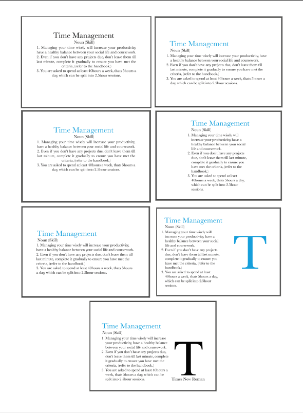
Here is the development of my layout. I decided to position the text towards the bottom, leaving the top area blank due to the cards being picked up from the top, this will leave room for any fingers to grasp the cards without restricting the view of information.

Recent Comments