UCC Coffee: Charity bundle concept
Posted: April 19, 2016 Filed under: competitions, Subject Y3, Year 3 | Tags: advantage, blends, bundle, careers, charity, coffee, community, concept, degree, design, donations, education, exhibition, fair, fairtrade, final, future, graduation, granulated, graphic, growth, healthcare, idea, improvements, last, mug, outcome, personal, posters, project, project_2, prospect, reflection, review, revisit, sachets, show, student, third, UCC, university, year Leave a commentFor one of my additional ideas to a loyalty card and to focus my project aim of highlighting the farmers behind the coffee, I have created a charity bundle concept. The idea is that the customer can buy a signature mug with a inspiring or awareness message on the side to show they are in support of sustainability and fair-trade. The bundle will include a awareness mug and a selection of sample sachets of the unique coffee blends for the customer to use at home. The bundle will be packaged into a small gift sized box with a window for the user to see what they are purchasing.
The bigger image to this concept is that the money raised through the purchases of these bundles will be donated to the UCC global charity which aims to provide careers, healthcare and education to the coffee farmers and local villages that are in the community of UCC Coffee. The communities being the areas in which UCC cooperate with such as Brazil, Peru and Vietnam sites.
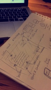
On Monday, I trial ran the net design and printed out a copy on paper to see if my measurements were correct. I had made one error on the inner red panel on its hight size, I did not account for the already elevated platform which the mug sits in and so it was slightly too tall for the package. I quickly adjusted this and the box worked! success! My next step is to create the graphic elements onto the packaging and possibly decal onto the acetate window. I will hopefully create 3-4 different package designs which each highlight a different aspect of the charity program. I would like to highlight the issue of endangered animals in response to deforestation, caused by corporate coffee farms as well as the coffee farmers and the educational programs in place.
UCC Coffee: Tray liner/ poster
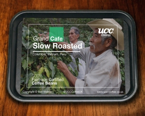
Posted: November 24, 2015 Filed under: competitions, Subject Y3, Year 3 | Tags: aspet, award, awareness, blend, cafe, certified, coffee, competition, concept, designer, eco-friendly, ethical, fair, farmers, fresh, grand, graphics, group, hierarchy, history, human, illustration, layout, liner, origins, poster, promotion, quality, rebrand, recycled, reimagined, revitalisation, roasted, slow, student, sustainable, traceable, trade, tray, UCC Coffee, YCN Leave a commentAfter researching different points of contact the consumer has with the product, I thought of traditional forms of communication and advertisement within a café. Often consumers buy food in cafés which may be accompanied by a unique UCC Coffee blend. This would be placed on a tray and then carried to the table. I was inspired by fast food restaurants, e.g. McDonalds – with their tray liner and decided to explore the possibilities of using this liner to advertise each unique blend UCC have to offer. I began by drawing out a basic layout and played with the hierarchy of text and image placement. I was excited to dive straight into digital exploration and initially designed four liner posters with high quality coffee-related stock images. Upon completion I really liked the outcome however I felt this did not respectfully contribute to the brief as it did not raise awareness to the ethical and fair-trade qualities off UCC Coffee. I redeveloped these liner posters with images of photos of coffee farmers from the origins of which the individual blend was harvested, e.g. Brazil & Peru.
Note: Sources of the images are credited at bottom of post.
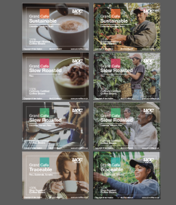
The ethical aspect of these liner posters bring awareness to the people who work hard to make UCC Coffee possible. The layout of the text is set on the left side of each poster with the corresponding coffee farmer within the negative space. This information-free zone brings importance to the human aspect and quality of delivering fairer coffee beans to you, the consumer. These will be printed onto recycled materials with eco-friendly ink to help promote sustainability in the process.
These posters also have the possibility of bringing deals and statistics of ethical trade from UCC to again highlight the positive effects of drinking UCC Coffee.
UCC Coffee: Coffee Label Redesign
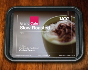
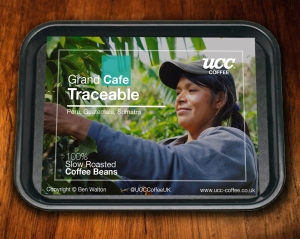
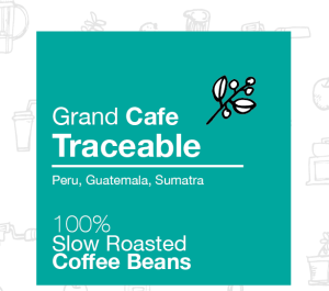
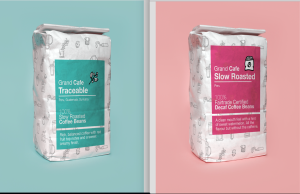
Posted: November 24, 2015 Filed under: competitions, Subject Y3, Year 3 | Tags: 500g, awards, beans, blend, brand, brief, cafe, certified, coffee, colour, competition, contrasting, ethical, fair, formal, grand, graphics, hierarchy, identity, illustration, label, mockup, modern, monotone, original, packaging, palette, pattern, presentable, rebrand, revitalisation, roasted, slow, student, traceable, trade, UCC, YCN Leave a commentThe first touch point I wanted to rebrand was the coffee packaging. I liked the idea of having a generic plain packaging which would made from recycled material and eco-friendly ink. This would be similar across every blend of coffee from Grand Café. Upon packaging each blend would have their own sustaina-label applied with their own unique colour to be easily identifiable to the consumer. I started off with a square block of colour to give the company a modern approach to symmetrical design. I followed this by adding an additional rectangle below for additional information. After manipulating and formatting the text I was happy with the layout. I feel it has a clean and understandable format and hierarchy of text. I decided to use white text for clarity and reinforce the ideology of sustainability through the use of lighter colours.
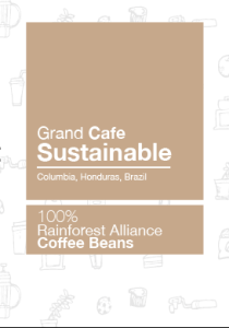
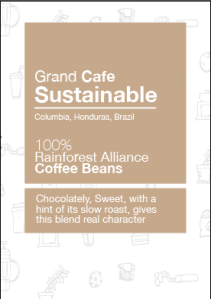
To keep the colour theme original I steered away from coffee colours and added contrasting tones to the different blends available. The brief does identify that I am not restricted to the packaging and available blends which gives me the freedom to really explore the brands possibilities to make the packaging presentable on small coffee shops counters and connect to the modern consumer.
Here are 2 alternative mockups of possible coffee 500g packaging. I explored the positioning of the label and found that it was more sensible to have the label lower down to allow the consumer to refold the packaging after use, keeping the coffee’s taste and aroma fresh.
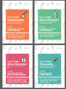
Here are the four different blends and their recognisable colour palettes.
My next move is to apply the certified logos on each of the packaging accordingly. I am also going to explore and illustrate ethical-related packaging wrappings, possibly for each individual blend to allow myself to relate it to the culture and background of the coffee’s origin in a step towards fair-trade awareness and promotion to the consumer.
UCC Coffee: Research
Posted: November 18, 2015 Filed under: competitions, Subject Y3, Year 3 | Tags: brand, brief, BRITA, cafe, case, certified, client, coffee, concept, consumers, creative, dedicated, development, documentation, economic, efficient, environment, ethical, fair, farmers, friendly, grand, graphic, group, growers, ideas, identity, illustration, Ireland, japan, landfill, origin, personality, professional, project, range, record, research, resource, social, study, sustainable, traceable, trade, UCC, uk, united, vision Leave a comment
What is UCC?
UCC is Japan’s largest producer of coffee and is responsible for £2bn annual sales turnover globally and 7,300 employees, including 30+ Q-graders and World Siphonist Champions. It supplies some of the world’s leading companies in retail, out of home and industrial markets and owns successful retail and out of home brands – Source
About Grand Café
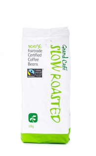
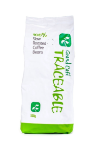
Grand Café is a specific range created by UCC Coffee which is 100% traceable to its origin and fully certified to be ethically and sustainably suited to be fair-trade to the land and farmers who grow their coffee.
Vision: To be the most respected certified coffee brand in the out of home market.
Brand Concept: Promoting the social and economic benefits of certified coffee whilst providing a feel good factor and peace of mind.
Reasons to Believe: Committed to industry certifications FT, Organic and RFA; solid taste test performer; our best-selling branded product range
Brand Personality: educated/knowledgeable/travelled/down to earth/respected/direct/academic/possesses gravitas
Tone of Voice: friendly/accessible/no jargon/matter of fact
Sustainability
UCC Coffee source certified sustainable coffees from farms and cooperatives across the world, which are each 100% traceable to their origin. Their ethical credentials include, Fairtrade Rainforest Alliance and Soil Association. This in turn makes their coffee fair for growers, the environment and their customers.
UCC Coffee are also dedicated to improving their resource efficiently throughout the life cycle of production. Their packaging is part of the Comply Direct compliance shame which means that their machines are selected for their energy efficiency. They also continue to cut their carbon emissions from their roasters and fleets too.
The company select their partners and suppliers carefully who are as dedicated to the environment as UCC Coffee. Amazingly they even recycle all of their water filters through one of their partners BRITA Professional, whom have more recently achieved zero landfill status.
Target Audience
The ideal target audience are businesses who are ethically aware, this includes non-branded coffee shops, cafés, pubs, quick service restaurants and contract catering. UCC Coffee does not sell directly to consumers however, the nature of Grand Café means that it is only available to companies who comply with their corporate responsibility requirements. More recently more and more businesses are becoming aware of their impact through their buying choices and looking for a coffee that promotes sustainability in the industry.
Core Products:
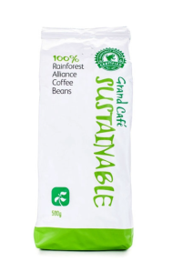
Grand Café Rainforest 500g
Tasting notes: Chocolately, sweet, with a hint of its slow roast, gives this blend real character. Bright and balanced with citrus hints and a clean and balanced aftertaste.
The source: Colombia, Honduras, Brazil

Grand Café Fairtrade
Tasting notes: Deep, intense coffee with a full body and lasting taste.
The source: Colombia, Vietnam, Peru

Grand Café Triple Certified
Tasting notes: Rich, balanced coffee with red fruit top notes and a sweet creamy finish.
The source: Peru, Guatemala, Sumatra

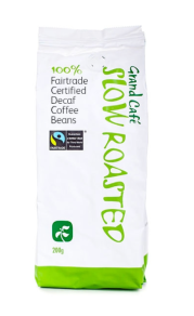 Grand Café Fairtrade Decaf
Tasting notes: A clean mouth feel with a hint of sweet watermelon. All the flavour but without the caffeine.
The source: Peru
History
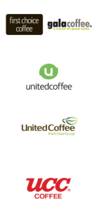
“UCC Coffee UK & Ireland has been operating in the UK coffee market for over 20 years, but wehave not always been known by the same name.
In 2010, First Choice Coffee – the UK’s OOH coffee market leader – and Gala Coffee – the country’s largest retail own label roaster – merged to become United Coffee UK & Ireland and part of the United Coffee European Group.
Having operated independently, the combined strength of both businesses and ambitious growth plans, led to the transformation of United Coffee into the UK’s leading total coffee solution provider.
In 2012, United Coffee Group was acquired by UCC Holdings Co Ltd. (UCC), to create one of the top five biggest independent coffee companies in the world. Following the acquisition, United Coffee retained its identity before rebranding as UCC Coffee UK & Ireland in 2014. – Source

Recent Comments