Blog shoutout for Isa
Posted: April 19, 2016 Filed under: Other | Tags: blog, brazilian, coffee, communication, designer, follow, graphics, green card, illustration, inspiration, international, kebab, shoutout, stalker, traveller, vectors, World, world traveller Leave a comment
See what Isabela is up to in her final year of university below;
https://isabelaassiria.wordpress.com
SSP: App Functionality Research
Posted: February 19, 2016 Filed under: Field Y3, Student Set Project, Year 3 | Tags: airbnb, art, brief, cardiff, design, final, graphics, HSBC, information, inspiration, project, research, review, student, uber Leave a commentTo begin my thorough research into this project I want to look at app functionality and successful mega-trend applications. What makes their layout and UX work? how have they incorporated imagery, videos, sound etc. By researching this, I can use the information to create an application that is user friendly. To begin, I wanted to look at Airbnb and Uber which are mentioned in the HSBC brief as ‘market-changing’ concepts. Personally I have never used these, however Uber is being brought to Cardiff in response to the poor taxi service current black cabs offer, although they have improved vastly since more and more take to social media to shame those who refuse service.
Looking at Airbnb:
Airbnb has been hugely successful with providing accommodation across 190 countries. It continues to be one of the largest players in the market and is increasingly growing due to its relentless focus on design, usability and booking efficiency. The concept is very simple, it is a peer-to-peer accommodation rental service offered through cloud technology. It is more authentic than well-established companies such as Travelodge or Premier Inn who can be very expensive depending on the date and location. Guests get double the space they find at hotels for the same price and the service is often perceived as high value. The ‘sharing economy’ has become a mainstream concept to put buyers and sellers together, this was first used by eBay and then followed by Gumtree. This can also be seen on business investment sites such as Kickstarter.
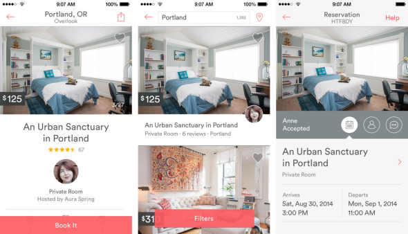
The mobile app itself uses a simple and minimal use of colours within its brand identity. Its use of iconography again follow the brand visual. The app also brings a sense of community to it by including the profile of the host and the reviews per room. There is user customisation through the use of filters, location and booking page. The app also allows user communication to insure a present relationship within the sharing economy. The main structure of user accessibility is on the top bar which leaves the rest cluster-free for a larger user experience while browsing for accommodation.


Airbnb’s recent rebranding brought beautiful typography and simplicity to their logo, website layout and phone app. It confined its wide range of colours/ shades and made the transition from serif to san-serif to meet the expectation and online design trends of the modern day. This gives it a more friendly and less corporate theme. Its unique logo is now easily recognisable due to its simplicity and subtly use throughout their brand awareness. What I notice most is the use of negative space to reveal the powerful imagery which conveys a sense of adventure and inspires curiosity within the user.
Looking at Uber:
Uber again uses the same sharing economy trend to give users the ability to share rides with other users. This in turn means cheaper fares and possibly a more pleasant journey.


Uber’s website uses a limited selection of colours for its brand identity and carefully uses negative space and fantastic hierarchy of text to give the content a visually stunning appearance with a warm, friendly tone. The first page actually uses a video to capture the emotion and atmosphere of the user experience. My favourite part of the Uber website is the parradox-styled transition between each scrollable page, as the text transitions the geometric imagery on the mobile device simultaneously changes. This is a really engaging niche to show the narrative of the service in a visual way.
Compassion is True Communication
Posted: May 12, 2015 Filed under: Research, Year 2 | Tags: advert, aid, changed, compassion, faith, giving, helping, inspiration, powerful, prisoner, war Leave a comment
This advert believes that giving is the best form of communication. It adapts the most respectful form of giving which is compassion. When we show sympathy and empathise with others we do not expect anything in return. There are no verbal ways of communication in the main scene but only the differences in terms of language, society and culture which suggests compassion is a universal way of communication.
Penguin Submit workshop
Posted: November 7, 2014 Filed under: Subject Y2, Year 2 | Tags: amending, bleed marks, brief, client, contact, design, errors, hierarchy, illustrator, indesign, inspiration, notes, penguin, photoshop, printer marks, reminder, typography, workshop Leave a commentLooking at the Printer marks, spine folds and bleed marks within the amended template for the
Penguin Brief.
A never-ending reminded – the bleed mark is a fail safe, normally 3mm however in this case it is 5mm.
Never alter the copy or fix efforts. Tell the client of any mistakes that you find and ask for an updated cover copy so any changes made are recorded. Always copy and paste the data as this prevents any typos and language errors made by you, the designer.
Remember;
Typographical Hierarchy
Be aware of quotes
Get inspired
Take Risks
Typography is an art form
300dpi for print, 72dpi for screen-based media
Photoshop for images, Illustrator for vectors, text-based media.
The digital design path: PS -> IS -> ID (photoshop-Illustrator-Indesign) for Pics-Typography-PDF
When editing the amended template, create a layer below the copy later to prevent the original layer from being manipulated or obstructed.
Looking at the work of Sandra Chevrier
Posted: May 4, 2014 Filed under: Field | Tags: art, artist, caged, Castle Arcade, Chevrier, collage, comic, experience, fantasy, french, hidden, illustrator, inspiration, limitations, meaning, metaphor, modern, pressure, reality, Sandra, society, women Leave a commentAfter looking for artists and creative work which may relate to my theme I came across Sandra Chevrier. Chevrier is a French artist who’s work allows her to experiment over a range of emotional and mysterious concepts. Her work called ‘Super Heroes Cages’ caught my eye from their fascinating appearance. She uses collages of light and heavily painted textures to create portraits of women. The portraits reveal the women in an instinctive way, many have their mouths or eyes masked with a comic collage, this effect was to portray the women as ‘caged’ from their natural self. This lovely metaphor suggests that society’s view on women can sometimes be sexist but subjects women to make them conceal their appearance to ‘look pretty’ etc. Chevrier being a full-time single mum also suggests that the comic collage which masks the women’s appearance may mean that their is so much pressure on them that they hide-away their true identity much like a super-hero. This could also mean that women are sort of super-heros for being able to cope with the pressures of society inflicted on them in the modern age.
I feel this artist can connect to my theme Hidden City as this pressure on women is hidden from view much like their facial features by the collaged texture. I would like to experiment with this style of collage-layering to conceal the hidden architecture in Castle Arcade on the upper level – which not many people would see due to the lack of interest upstairs. Instead many people use the Castle Arcade as a shortcut to and from Castle street to Market street.


“She exposed the limitations Within our world, our self-imposed expectations and the cages we-have allowed to bar us from fullness of life’s experience. ” – Taken from her bio, translated on google.
http://www.sandrachevrier.com/bio
Berlin S-Bahn Ticket Artist
Posted: March 4, 2014 Filed under: Field | Tags: artist, city, collage, connection, field, hidden, inspiration, linked, research, s-bahn, ticket 1 Comment
After looking at redesigning the U-Bahn Transport ticket I came across the work of Kurt Schwitters, a German artist who worked with Dadaism, constructivism, Surrealism and many more, but mainly famous for his collages such as this one. He uses a range of items which he finds on the floor such as train tickets and receipts and makes unique collages out of them, this is because Schwitters has a philosophical approach to rubbish and says that ‘waste material has just as much validity as paint as artistic tools’. I like the contrasting colours between black and shades of white which indicates the decaying or age of the rubbish. I would like to experiment with this style of collages with my own tickets but also from other tickets I can find around Cardiff train station for example.
Actor put into 6 scenes in 1 shot
Posted: February 5, 2014 Filed under: Research | Tags: films, hidden, inspiration, location, moving, perspective, research, scenes, single, spot Leave a comment
Vibetown Typography
Posted: October 24, 2013 Filed under: Research | Tags: buildings, clouds, design, graphics, image, inspiration, portrait, research, roof, skyline, skyview, text, typeface, typography, Vibetown Leave a comment
A very interesting way to present text!
As Halloween is approaching! Blackletter Typekin
Posted: October 24, 2013 Filed under: Research | Tags: 17th, 31st, blackletter, carving, century, english, glowing, halloween, history, importance, inspiration, light, october, old, rememberance, seasonal, spooky, typeface, typography, warm Leave a comment
found this somewhere out there! Will make one of these – watch this space!
Hand lettering Engine Block by BMD Design #2
Posted: October 23, 2013 Filed under: Research | Tags: art, bmd, creative, design, drawn, engine, hand, inspiration, old, poster, research, typeface, typography, vintage, worn Leave a comment
Guess i’m a sucker for BMD’s design work! keep it up.
Hand lettering Engine Block by BMD Design

Recent Comments