Business Cards
Posted: April 20, 2016 Filed under: Subject Y3, Year 3 | Tags: business, cardiff, cards, china, CSAD, degree, designer, exhibition, final, graduation, graphic, identity, industry, internship, metropolitan, notice, open, public, show, students, undergraduate, university, ux, visit, visual Leave a comment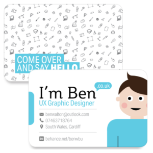
Today I made some improvements to my business cards and sent them off to be printed. I have added curved edges and a matte finish on 350gsm card. I made changes to the front which included taking away the program icons and adding my location along with symbols for the email, phone and location. I also adjusted the text sizes between my industry title and contact information. On the reverse side I have created a range of new hand illustrated icons to copy across the same style of pattern I created for my UCC Coffee project, which I will be exhibiting for my degree show. I have ordered 50 business cards which should be enough for my degree show.
Tutorial with David
Posted: April 18, 2016 Filed under: competitions, Subject Y3, Year 3 | Tags: advice, business, card, cardiff, coffee, communication, CSAD, degree, design, exhibition, feedback, final, graduation, graphic, improvements, last, layout, metropolitan, outcome, posters, project, reflection, review, revisit, show, student, third, UCC, university, year Leave a commentEarlier today I had another tutorial with my tutor to update them on my progress over the week. I discussed my exhibition space layout, business cards, charity bundle, packaging designs and overall content for my degree show.
To begin, my exhibition space. Firstly, I have put a lot of time into working on what I could include and how I could present it over the last week. I have bought the majority of the materials I need for my show excluding any prints. I have also thought outside of my work and looked into the wider content of the space. I went home to get help on creating a unique table from reclaimed pallet wood which I hope to use to present my outcomes. This will be accompanied by a create and coffee hessian bags. It was suggested that I step back from trying to make my space look too much like a coffee shop and focus on what I am trying to convey through my outcomes. This was fair advice and has made me rethink on ways I could incorporate everything that I would like to include as well as the important messages I want the viewer to perceive. One idea could be to have illustrated portraits of coffee farmers & large stories on the wall to document how an educational program has helped them and their community. Another idea would be to present awareness/ encouraging messages to engage the audience into an emotional response.
Another suggestion was not to have repetitive layout designs, I need to think about originality and unique text hierarchy. I could think about focusing onto different aspects of the packaging instead of the whole packaging on posters. I should also think about playing with abstract imagery like I have created for my honey packaging – example: ‘It’s the bees knees’. Incorporating a classic phrase into a bee-related product helps to tie in a light-humoured response to the brief. My coffee packaging could also do with minor improvements such as a more playful text hierarchy and equal distribution of the blend illustrations across the packaging. My bee nest above the text was seen as a lovely icon system which I could mimic across each blend.
Secondly, my business cards. My business cards were playful however it portrayed me as an illustrator, which was fine if that is what I would like to be perceived as by others. Which I happily am. The use of the program icons were confusing and useless as a graphic designer. People would assume that I already know these programs to become a graphic designer in the first place and so, presenting them on the card has no relevance. So I will see how I can add relevance or adapt my card to something new. The back of the card which simply reads ‘Nice to meet you’ is ok, however it will become more appealing if it said something like ‘come and say hi’ making it more personal and suggest a friendly gesture. I should think about the use of type and repetition. I could possible play with the hierarchy of weights to make it more visually appealing. I could also incorporate hand vectorised illustrations such as that from my UCC Coffee project. This will help others to connect my card to my exhibition where my cards will be placed. This suggestion has purpose, people from the industry will be viewing many different exhibitions during their time at the degree show and will collect a selection of cards, this way my business card will have a reoccurring illustration system in place to help them remember which exhibition was mine. I should think about making more illustrations to reflect my interests and area of practise. Things such as a computer, mouse, pen, notebook etc will be useful in providing a link between a graphic designer and the type of person I am.
Thirdly, my charity bundle. The packaging was on the right path to conveying my intentions for this project. It focuses on the famers and what the UCC brand can do in terms of education and healthcare. The brand is not set out to profit off these countries but instead work with them and help them in return. Its all about giving back to the communities. This is presented through my newspaper too. After todays tutorial I want to focus down my exhibition show to show my proposition of the UCC Coffee brand identity and brand values and portray this through my outcomes. This can be done as discussed above with wall messages, farmer stories and overall focus.
As we are into our next week already, My to-do list schedule means I will now focus primarily on ‘The Big Idea’ project which looks at our perception of social media. This was largely affected by my dissertation submission and priority focus and so I will need to reevaluate my idea, choice of medium, and aim of project & what message I want to convey. I have already started to brainstorm a few ideas and will continue to work to my tightly packed to-do list to make sure I touch upon the criteria of the brief. I am equally excited about this project as I have been for my Student set project and Competitions.
With my current progress I feel what I want to do is completely achievable for the last 2 weeks until my degree submission. The only worry I have is my portfolio. I have the information and content available but putting it into a universal format for my behance site will be time consuming which will eat into the time I could be using to polish up my outcomes to meet the criteria of my degree. Challenge accepted.
Exhibition: Preparing space setup
Posted: April 18, 2016 Filed under: competitions, Field Y3, Subject Y3, Year 3 | Tags: cardiff, coffee, communication, CSAD, degree, event, exhibition, graduation, graphic, industry, metropolitan, pallet, preperation, promote, public, reclaimed, rustic, show, table, UCC, university, upcycled, vintage 1 Comment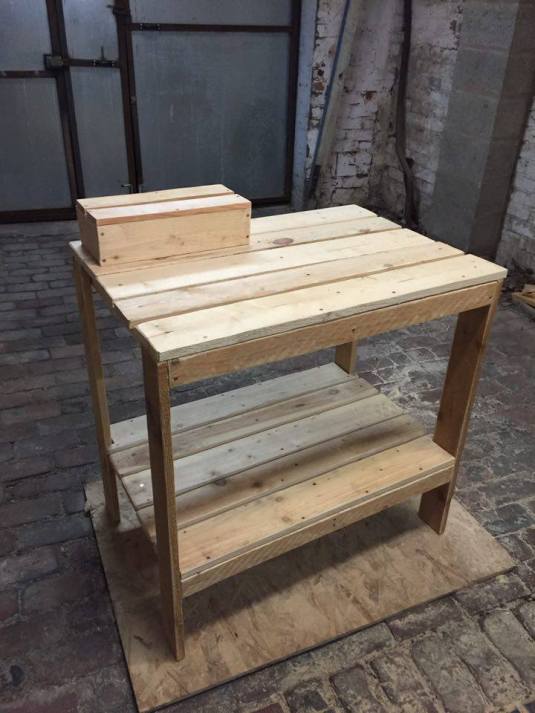
On the weekend I headed home to sort out my exhibition table I designed earlier in the week. My dad helped create my sketches into a presentable table and even a create & table stand! For my sketches, I estimated the size based on my outcomes already produced. I left room for additional items which I planned to make between now and the degree show, however the table was too big to bring back with me so I will have it dropped off in the coming week. I am unsure if I am going to varnish it or to just put a sealant on it. There is enough room on the bottom shelf for the create and additional items I will add for genuine coffee content which I am going to purchase in the next few days. With my table set, I rest easy knowing my desired space will be available and unique to the degree show. I hope that all of my items will fit onto it without it feeling crammed. My next steps are to think about the environment around the central table such as the floor and walls. I already have a concept which I will research further before blogging about. Now my exhibition setup is out the way I can use the last couple of weeks to focus and reflect on ‘The Big Idea’ and upload my portfolio to Behance, ready for submission.


Initial Exhibition Proposal
Posted: April 13, 2016 Filed under: competitions, Subject Y3, Year 3 | Tags: 2016, blend, cardiff, coffee, CSAD, degree, design, event, exhibition, final, graduation, granulated, graphic, graphics, improvements, industry, last, met, mockups, outcome, posters, presentation, project, reflection, review, revisit, show, student, table, third, UCC, undergraduate, university, year Leave a comment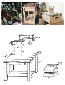
For my exhibition I had to choose 1 of my 5 projects from third year to display as my best piece which will be seen by the public and people from the industry, who may offer jobs to the best executed pieces. Out of my projects, Competitions, Real World, Student Set, The Big Idea and Penguin Book Covers I have decided to pick my competitions project – UCC Coffee due to it being able to have more physical outcomes instead of a limited screen-based exhibition, which I felt would be less attractive.
Revisiting my portfolio
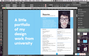
Posted: March 22, 2016 Filed under: Field Y3, Year 3 | Tags: branding, briefs, cardiff, clients, design, graphic, hire, HSBC, jobs, live, me, portfolio, projects, revisiting, undergraduate, work Leave a commentOver Easter I want to revisit my third year portfolio to help me after graduation when applying to the industry. I have been productive by getting up early the past few days to get on with my work. I really like the progress I have been making and hope I can continue this over my days off. I want my portfolio to be A4 size as it is easy to store away in a bag during interviews. I hope to get this printed and bound when I am back in university after the holidays. I want to use a range of vibrant colours to draw attention to different elements of my work without it being over dramatic. I will experiment around and see what works best. It would also be visually engaging if I can take photos of my physical pieces with content such as coffee beans for the UCC Coffee project so that the mockups are not flat and generic.
SSP: HSBC Layout Experimentation
Posted: February 19, 2016 Filed under: Field Y3, Student Set Project, Year 3 | Tags: app, application, cardiff, concept, creative, curiosity, design, exploration, finance, generation, graphics, HSBC, idea, information, layout, management, mobile, mortgage, project, research, responsive, review, set, sketches, student, undergraduate Leave a comment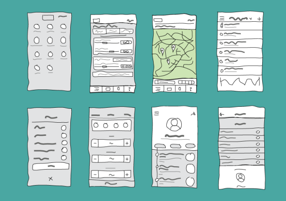 I decided to look at other app layouts for inspiration to help me create a simplistic and efficient layout for my concept. I sketches out many layouts by combining different aspects of the researched apps to create a hybrid design. Although at this time, there is no brand or layout consistency as I wanted to experiment with different possibilities and ways to display the pages. From here I will select which layouts I prefer most and begin creating a fixed layout which will carry the brand identity and allow the app to flow efficiently. I am interested in creating a social aspect to my concept which will allow others in a similar position to share their experiences with friends and family, or possibly other first time buyers while still keeping the users information such as finance and location, safe and secure.
The main features I am curious in designing are the in-app savings account for a mortgage in which the customer can deposit from other HSBC accounts to keep their savings separate from their everyday accounts. I am also very intrigued to research and conceptualise a way to easily view the progress of an outstanding mortgage application, modify or add other users to the application in which they can view, edit or deposit to the mortgage, these functions will be managed by the sole account holder of the mortgage. This concept functions to add family members or partners onto the mortgage application to proof-read, edit and contribute to the funding of a mortgage. Bringing the traditional idea of a mortgage and turning it digital is an exciting prospect and I am super excited to see its development over the next few weeks.
SSP: App Functionality Research
Posted: February 19, 2016 Filed under: Field Y3, Student Set Project, Year 3 | Tags: airbnb, art, brief, cardiff, design, final, graphics, HSBC, information, inspiration, project, research, review, student, uber Leave a commentTo begin my thorough research into this project I want to look at app functionality and successful mega-trend applications. What makes their layout and UX work? how have they incorporated imagery, videos, sound etc. By researching this, I can use the information to create an application that is user friendly. To begin, I wanted to look at Airbnb and Uber which are mentioned in the HSBC brief as ‘market-changing’ concepts. Personally I have never used these, however Uber is being brought to Cardiff in response to the poor taxi service current black cabs offer, although they have improved vastly since more and more take to social media to shame those who refuse service.
Looking at Airbnb:
Airbnb has been hugely successful with providing accommodation across 190 countries. It continues to be one of the largest players in the market and is increasingly growing due to its relentless focus on design, usability and booking efficiency. The concept is very simple, it is a peer-to-peer accommodation rental service offered through cloud technology. It is more authentic than well-established companies such as Travelodge or Premier Inn who can be very expensive depending on the date and location. Guests get double the space they find at hotels for the same price and the service is often perceived as high value. The ‘sharing economy’ has become a mainstream concept to put buyers and sellers together, this was first used by eBay and then followed by Gumtree. This can also be seen on business investment sites such as Kickstarter.
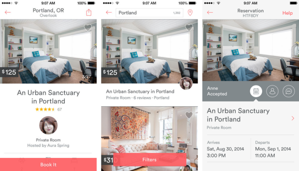
The mobile app itself uses a simple and minimal use of colours within its brand identity. Its use of iconography again follow the brand visual. The app also brings a sense of community to it by including the profile of the host and the reviews per room. There is user customisation through the use of filters, location and booking page. The app also allows user communication to insure a present relationship within the sharing economy. The main structure of user accessibility is on the top bar which leaves the rest cluster-free for a larger user experience while browsing for accommodation.


Airbnb’s recent rebranding brought beautiful typography and simplicity to their logo, website layout and phone app. It confined its wide range of colours/ shades and made the transition from serif to san-serif to meet the expectation and online design trends of the modern day. This gives it a more friendly and less corporate theme. Its unique logo is now easily recognisable due to its simplicity and subtly use throughout their brand awareness. What I notice most is the use of negative space to reveal the powerful imagery which conveys a sense of adventure and inspires curiosity within the user.
Looking at Uber:
Uber again uses the same sharing economy trend to give users the ability to share rides with other users. This in turn means cheaper fares and possibly a more pleasant journey.


Uber’s website uses a limited selection of colours for its brand identity and carefully uses negative space and fantastic hierarchy of text to give the content a visually stunning appearance with a warm, friendly tone. The first page actually uses a video to capture the emotion and atmosphere of the user experience. My favourite part of the Uber website is the parradox-styled transition between each scrollable page, as the text transitions the geometric imagery on the mobile device simultaneously changes. This is a really engaging niche to show the narrative of the service in a visual way.
Student Set Project: Final Project
Posted: February 17, 2016 Filed under: Field Y3, Student Set Project, Year 3 | Tags: branding, briefs, cardiff, creative, D&AD, design, field, graphics, packaging, portfolio, project, research, set, student, three, undergraduate, visual, YCN, Year 3 Leave a commentWith ‘The Big Idea’ project presentation over, we have moved onto our final major project which is student set. I have until Thursday to choose or create my own brief which I will explore and develop over the next 5 weeks. This project is my final chance to demonstrate the skills I have learnt over the last 3 years at university. It’s a scary thought but I am very excited to explore the freedom of this project and select a brief that I am enthusiastic about. I will research the available briefs on sites such as BriefBox, YCN, D&AD, ISTD, Penguin etc. Each of these sites have a large collection of live briefs from companies like John Lewis to Desperados.
I really enjoyed working on the competitions for one of my previous projects and felt that they were perfect for this project too, in contrast to writing my own brief. I looked at BriefBox first and found many which appealed to me. Some of these included;
A visual identity for painter & decorator Alison
Alison Bow needs a visual identity for her painting & decorating business. She is looking for a bold, playful and contemporary design which is needed primarily for business cards to hand out to potential clients. She is interested in strong use of colour, geometry and pattern within her work and would like to reflect these elements in her identity.
Deli & Co revitalisation
Deli & Co sell fresh, high quality sandwiches, wraps & rolls. They have asked that you design a print that will feature on their takeaway food wrapping papers. They are keen on bold & modern graphics & icons. Remember to include the Deli & Co name & think about icons that would represent what they sell.
For this, I would adapt the brief to stretch across the five weeks and redesign multi touch-points for the deli shop from a website, points of contact and packaging. This would be a very creative and fun brief to dive into.
A bicycle rental shop in Amsterdam
A bicycle hire company in Amsterdam would like a custom logo design. Canal Cycle is situated in a popular tourist area within the city & would like to appeal to visitors with a strong & modern, typographic logo. They would love a logo using custom type, so be creative & bold!
For this, I would again extend the brief to reimagine the shop window, website, bike identity, logo and multi-touch points for the shop.
A virtual tour map application
Mi-Guide are bringing a virtual tour to your city through an app, and we want you to design an interactive map that showcases the best bits of your town. This app will aim to show visitors the popular landmarks as well as the best views that only the locals know about. Consider an interactive interface and easy to follow diagram, & think about the different features that the app could offer to show the most popular destinations, even giving tips whilst out and about.
Although I am intrigued to explore the possibilities of each of these briefs, and I may do so in the future as side projects, I will continue to explore the briefs from the competitions section of the course from D&AD and YCN as their briefs are more thorough and can be submitted for official marking for a chance to be awarded internships and graphic designer positions within the chosen company.
UCC Coffee: Sustainable Design; Style Research
Posted: November 17, 2015 Filed under: competitions, Subject Y3, Year 3 | Tags: calm, cardiff, cheap, coffee, collective, concept, contrast, eco-friendly, ethical, graphics, illustration, indie, local, materials, not respected, products, quality, rebrand, recycled, research, revitalisation, shops, small, start-ups, style, sustainability, tesco, traditional, UCC, value Leave a commentUCC Coffee Brief – “We don’t sell directly to consumers; and our core current customers are non-branded coffee shops, cafés, pubs, quick service restaurants and contract caterers but that isn’t to say they are the only target for the brand. The nature of Grand Café means it ticks a lot of the boxes for companies to fulfil their corporate responsibility requirements.”
Locally there are a few interesting sustainable non-branded coffee shops where are start-up cafés which focus on the consumer experience over profit. They act as a base for networking, social gatherings and discussions within an informal environment.
CF24 Project
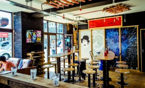
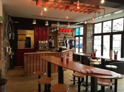
The CF24 Project is a perfect example of a small café/bar which would be suitable for UCC Coffee. Its choice of minimal decor and makeshift furniture from pallets reinforces the ideology and intentions of sustainability. They offer a small selection of food to keep their customers fulfilled during their stay.
I feel that the packaging must look professional with a spark of character to have the appliance of a professional and respected coffee with the contrasting imagery of a fun, sustainable and fairer coffee which is appealing to both young and older consumers. I also feel the packaging must be heavily influenced through the sustainable aspect e.g. recycled material and eco-friendly ink which reflect the ethical and sustainable approach UCC Coffee are wanting to raise awareness and promote.
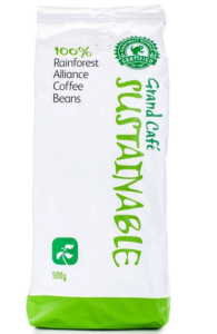
The current Grand Café packaging is nothing close to a presentable package which could be presented on the counter to a small cafe like that of the CF24 Project. Its bright use of negative space and cliche sustainable green colour pallet highly contrasts against the traditional, indie vibe of small sustainable cafés. The use of these colours also reminds me personally of ASDA and Tesco essential packaging which brings imagery of cheap, unsustainable and unethical products. The quality of the product is also penalised as a result of mass-manufactured packaging.
Persuasion Revisited
Posted: May 31, 2015 Filed under: Subject Y2 | Tags: card, cardiff, design, development, editing, graphics, homeless, improvements, order, persuasion, professional, pvc, review, shelter, student Leave a comment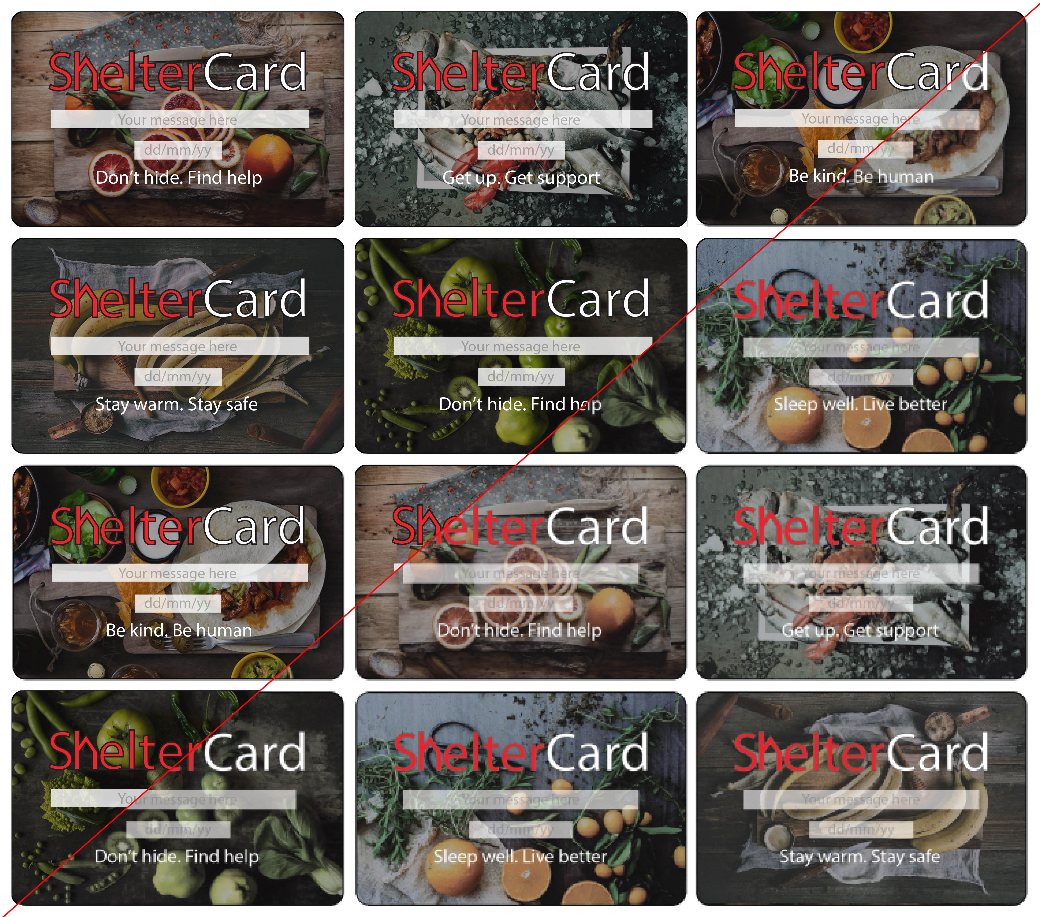
This week has been busy, I have revisited all of my projects to make adjustments and general improvements. With persuasion I was advised to make adjustments to the position of the card name. After some experimentation, I felt the card was to bland. Instead I worked with what I had and added a cleaner layer between the text & the image and then increased the stroke thickness on the outline of the text. This general adaption has made a huge improvement to the ShelterCard. I also worked on cleaning up the packaging and made minor improvements to the text. After making these improvements for my final review on Monday, I have ordered 2 ShelterCards to be professionally printed onto PVC card. This will allow me to inspect the quality before ordering a larger quantity.

Recent Comments