UCC Coffee: Revisit
Posted: April 10, 2016 Filed under: competitions, Subject Y3, Year 3 | Tags: abacus, brand, cafe, cafes, cf24, cmyk, coffee, colour, companies, ethical, experimentation, finalisation, grand, graphic, graphics, icons, identity, illustration, indie, modern, monotone, points, problem, project, resolved, revisit, revitalised, small, student, sustainability, time, touch, UCC, undergraduate Leave a comment
With just only a few weeks left, I am aiming to revisit 4 of my projects to finalise their content and to finish off any ideas I may have. With my to-do list I am going to focus on a different project every 4 days to give myself plenty of time to reflect on my overall work and for me to improve my portfolio and exhibition piece.
My first project from today is for competitions, UCC Coffee. For this project I revitalised the packaging design of a small selection of blends from Brazil, Vietnam, Peru and Guatemala under the name Grand Cafe Coffee. This coffee was to be on the shelves of small-time sustainable cafes and restaurants, not branded establishments. The brief asked for the packaging to reflect the brand values of sustainability and fair-trade to the coffee farmers. My previous attempt at this was exciting and I really enjoyed experimenting with hand-drawn illustrations. I feel this effect was unique and innovative which suited the small-time cafes and restaurants image. It made the packaging feel less corporate and encapsulated the personal qualities of a sustainable, fair-trade coffee.
I want to revisit the selection of packagings I have already created and work on them to make them more location-focused to express the culture and farmers behind the coffee beans. To do this I will research into the iconic imagery of each location and how I can bring this into my designs. I would really like the packagings to link up when they are positioned next to each other to show their unity.
I will also explore the possibility of using this project as part of my Exhibition piece as there are many possibilities that I could work with in terms of exhibition space to engage the audience.
YCN: HSBC Submission
Posted: March 23, 2016 Filed under: Field Y3, Student Set Project, Year 3 | Tags: advice, app, brief, buddy, buyers, communcation, concept, design, develop, field, final, first, graphics, helpful, HSBC, idea, ideas, informative, interface, manager, mobile, mortgage, original, phone, pocket, project, research, savings, set, student, submission, supportive, time, tips, undergraduate, unique, visual, web, YCN Leave a commentToday I submitted my HSBC project which I have been working on for the past 5-6 weeks. I was expecting to pay a small fee for participating but it turns out the YCN briefs were actually free! I feel happy with my outcome however I will continue to improve and will revisit the project before final submission to make sure it answers the brief fully. They will judge the competition submissions at the start of April and the commendations will be published in June. The YCN Student Awards ceremony will take place in September, with the next YCN Student Annual published thereafter. I am happy enough just to have my work marked by the judges but it would be a fantastic award to have if I am lucky enough to be one of the applicants that are commended. Fingers crossed.


UCC Coffee: Illustration Experimentation
Posted: November 23, 2015 Filed under: competitions, Subject Y3, Year 3 | Tags: abacus, brand, cafe, cafes, cf24, cmyk, coffee, colour, companies, ethical, experimentation, grand, graphic, graphics, icons, identity, illustration, indie, modern, monotone, points, problem, project, resolved, revitalised, small, student, sustainability, time, touch, UCC, undergraduate Leave a comment

To begin my project I wanted to create a brand identity for UCC Coffee. To do this, I took inspiration from my year two brand world project ‘Hunter Company’. I started this by drawing out many small icons which reflected coffee and the touch points of the coffee-consumer relationship. I drew things such as coffee mugs, utensils and machinery. I scanned these into illustrator and used the trace tool to turn these drawings into digital illustrations. I have recently really enjoyed using this method of creating digital illustrations as their imperfections add character to digital based media.


As you can see below I created a range of icons suitable to use for the brand identity. I selected around 10 icons which I most preferred and started to tightly arrange them into a pattern. I wanted to keep the colour scheme monotone as to not attract to much attention from the consumer. Instead I think putting colour into the labels and Grand Cafe identity is a more sensible option.


I felt that the tightly packed pattern is very effective, however when used as a background it feels to clustered and dark which contrasts against the ideology of greener, purer brand intentions which UCC would like to promote within this brief.

To resolve this design issue, I redeveloped my pattern by spacing out the icons , I also kept the majority of the icons horizontal to make it easily identifiable to the eye. From here I would like to experiment with overlaying this pattern onto various touch points to reinforce the revitalised brand identity of UCC Coffee.
Touch points I would like to cover over the next week: Coffee cup, posters, sugar sachets, various forms of coffee packaging, tray liner sheets, staff uniform, table information leaflets/ signs.
These will experiment and continue a brand identity I will revitalised for UCC Coffee’s product Grand Café.
Contemporary Art with Jon Clarkson W7
Posted: December 14, 2014 Filed under: Constellation Y2, Year 2 | Tags: discontinuity, minuscule, notion, past, present, space, spirital, temporal, time Leave a commentWe looked at Mat Collishaw – All Things Fall (2014) which was one of my favourite pieces from the last 7 lectures. It represented the discontinuity of time in space. It showed moments of violence which returns to a state of harmony when at rest.
Spirital Discontinuity – Here and not here.
Deterritorialisation – The object or thing is stripped of its context but automatically receives another.
Notion of the present is difficult to express as the present is a minuscule moment in time which within an instant becomes the past. This is temporal discontinuity. 
Contemporary Arts with Jon Clarkson W3
Posted: May 10, 2014 Filed under: Constellation Y2 | Tags: art, circular, Contemporary, linear, measurable, moment, movements, orthodox, predictable, time Leave a commentTime can be seen as linear, but we can also see it as circular. We override our experience with orthodox time, measurable and predictable but thats not the only model of time.
Painters go beyond one moment.
Giacoma Balla – Dynamism of a dog walking on a leash, 1912
It depicts a range of moments to be show the truth of motion. It shows unique forms of continuity in space.
Fictitious Time is both coherent and incoherent.
Stopmotion: a slow beginning
Posted: November 26, 2013 Filed under: Format, Subject, Term 1 | Tags: deadline, drawing, duration, frames, help, istopmotion, joke, long, me, motion, pencil, process, slow, stop, time, triangle Leave a comment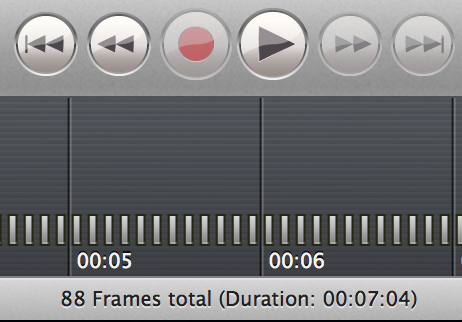
To start the project of a moving image I want to draw out each frame of my animation and put them together in iStopmotion then transfer it to iMovie to add sound effects. So far I have done 88 frames which has taken almost all day to do as the software is new to me, hopefully I will pick it up quickly and get to my 2minute mark by the deadline!
My concertina book
Posted: November 21, 2013 Filed under: Format, Subject, Term 1 | Tags: boat, book, booklet, concertina, horror, illustrations, mysterious, pencil, pocket, repeat, sea, ship, size, story, thriller, time, triangle Leave a comment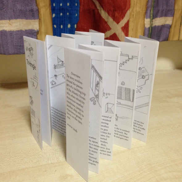
Here is my concertina book of the film Triangle. After completing this exercise I found that it was much harder than thought to fold the pages equally which took up a lot of time to get it correct. Once completed I feel that the final quality of the book lacks due to the grayscale format. I feel that the overview on the back page could be reformatted so the words are not split and I could also improve the images by illustrating them on Illustrator. This would provide a higher quality image and allow me to add a clean colour. The current version is still great due to its compact size and easy flow of text. I feel that the size of the text is perfect and the image size balances the block of text. This is also easy to reproduce as it only needs one A3 page. When reading the booklet, the way its created allows you to re-read from the beginning as the end runs into the beginning. To improve this I may use a higher quality paper or add a gloss finish. This will provide a sharper fold and increase durability. I will also add colour to the images and illustrate them accordingly. If you have any feedback please leave a comment!

Recent Comments