UCC Coffee: Prototype of packaging
Posted: December 6, 2015 Filed under: competitions, Other, Subject Y3, Year 3 | Tags: cafe, coffee, drawn, ethical, grand, graphics, hand, illustration, mockup, narrative, packaging, prototype, revitalisation, story, sustainable, UCC Leave a commentFrom my tutorial yesterday, I took on board feedback on trying to make the packaging unique and creative. I drew out a few sealable lids and preferred this a tear-away tab with resealable flap. The packaging size will be considerably bigger for the final outcome.


Under the flap, which will be usable upon tearing away the tab, is a hidden story to further raise awareness to the hidden procedures that happen to deliver UCC Coffee to the consumer in a sustainable and ethical way. Here is where the coffee pourer is introduced. There is a small opening which will have a plastic seal on to keep the coffee fresh and lock in the aroma. This can be reused again and again. The lid/flap will also be able to fold back into place.


For my next tutorial, I would like to integrate the farmer pictograms into my cafe illustrations and create 4 unique stories which highlight the stages of ethical & sustainable farming and what good it really does for the farmers.
UCC Coffee: The unique range of blends & tutorial
Posted: December 4, 2015 Filed under: competitions, Subject Y3, Year 3 | Tags: blend, coffee, competition, concept, copyright, design, drawn, feedback, graphics, hand, identity, illustrations, journey, modification, narrative, net, packaging, pattern, peer, product, review, revitalisation, story, tutorial, UCC, unique, user Leave a commentFrom my previous post, I have corrected minor typos and experimented with possible coffee cup designs. From here, I want to create a unique story for each blend to further promote their individuality and help raise awareness of their sustainably & ethically sourced origins. I would also like to give some information on the certificates each blend has to help teach those who are unaware of the projects and motifs in place by companies all over the world who are pushing for a fairer and more ethical community between third world countries and the big businesses who may exploit them.


After creating my coffee cup I was made aware of the similarity it has to Café Nero through the colour blue. Because of this, I feel it would be better to step away from total colour wrapping on coffee cups and focus on the brand’s pattern. I also have a few ideas of how the packaging would efficiently be sealed, I want to step away from the generic fold coffee bags have and so I will further manipulate the packaging net in my next prototype.

Today I had a tutorial with David on my collection of prototypes. He felt I still had a niche to grasp with the front label and suggested I continue to experiment with the label, possibly by designing it within a coffee leaf. My farmer illustrations also came into question as to whether they would be suitable for the brand identity however I feel it is difficult to capture the essence of coffee farmers through the limited tools used by the employees which can be related to other agricultural jobs, this distanced the identity away from a coffee product. I will continue to integrate farming equipment into my cafe illustrations and see where my experimentation goes from there. We moved onto the back, David felt that my ingredients and contact info was too small and appeared squeezed at the bottom. I can easily resolve this issue by moving the information onto the bottom or side of the packaging. This will then open up the back for me to add my unique story which could possibly highlight sustainable farming or the certificate information.
The tutor was pleased with my advancements since my last tutorial and is happy with my progress so far, my text hierarchy and colours are great and work well together. I do however need to update the main icons on the front of each blend to their own unique pictogram to further individualise each blend.
After the tutorial I sketched out some possible packaging modifications which will help with the sealing of the top. I was curious of a pop-out / lockable flap which would help keep the coffee fresh and full of aroma. I have an idea of a hidden pourable hole which will eliminate the need for a coffee scoop and encourage the barrister to use the packaging in front of the consumer. This will attract more attention and promote the sustainable coffee blends to other customers waiting in the que. My conceptual lid flap will also enable me to add hidden story for the consumer upon opening the lid.
Company Questions
Posted: April 4, 2015 Filed under: Subject Y2, Year 2 | Tags: budget, cardiff, charity, client, cold, communication, company, email, help, homeless, homelessness, ignored, information, invisible, issues, life, oxfam, problems, research, shelters, sourced, story, streets, volenteering Leave a comment1. What do you want to achieve?
If there are several aims, try to place them in order of importance.
Oxfam want to highlight the issue of poverty and homelessness within Cardiff. This minority are ignored on a daily basis within the streets of Cardiff which may lead to mental health problems and later alcohol and drug abuse. Oxfam would like to grasp the public’s attention on this issue within their day-to-day activities. A very few percentage of the public pay any attention, and even less give the minority group any change. Instead, people would rather pay for a tea or coffee in a cafe which is 100x more expensive than one at home. Oxfam would like to investigate this behaviour and how it can be adapted for a better cause. Oxfam have also come across many small-time companies which do a ‘pay-it-forward’ scheme whereby the customer can put money forward for a meal for the homeless.
2. What single thought would we like to leave the audience with after they receive this work?
Does the client want people to feel angry, or saddened, or amused. How does the client want people to act – e.g. by spreading the message amongst friends, acquaintances and family, making a donation or contacting the organisation for further information, or lobbying politicians?
Oxfam would like the audience to become more aware of this issue which is very local which in turn may increase the chances of volunteers, local charity work and fundraising. private donations would also be a great response from this non-profitable awareness scheme.
3. What do we know about the audience, recipient, consumers, their feelings and thoughts?
Try to find out as much information as possible.
Is it possible to develop a persona?
The audience ranges from all ages. Many people are oblivious to the issues around them as many are submerged within social media and consumerism, which fall below an individuals threshold for conscious perception.
4. What is the message? Help them sum it up in one sentence.
If there is more than one message, discuss their priority.
Poverty is all around us, even if its not as easily recognisable with 1 in 8 people unable to pay their bills on time. Whats more important, a quick coffee which will satisfy you for an hr, or a charitable donation which may improve someones lifestyle indefinitely.
Persuasion: Homelessness In Cardiff
Posted: April 4, 2015 Filed under: Subject Y2, Year 2 | Tags: cardiff, cold, detail, graphics, hidden, homeless, homelessness, ignored, invisable, life, personal, persuasion, poor, story, streets 1 CommentWe have started our new project ‘Persuasion’ today. We were asked to think of an issue or topic that we have strong passion or interest. At first I chose the Mars One Mission as I have a large interest in exploration and technology. However, after selecting this topic I was told that I would need to contact a company which overlooks this topic. I felt that I would have no hope in getting a response from NASA and so I changed my topic to Poverty, to which I would focus on the Homelessness in Cardiff. Homelessness is a lot closer than you’d think, with many on the streets every day. Many people ignore the minority are there which I can only try to empathise how it makes them feel. people have controversial views on the homeless, many feel that they should pull themselves together and find a job, which may be true, but it is mere impossible to get any sort of job without a permanent place of residence. Some may have mental or physical problems which restrict their ability to find a suitable job too.
Then why can’t they use the benefit system? well some fall through the system due to their circumstances not complying with the minimum requirements for benefits. This is especially hard for some. An example of this may be a divorce who had to sell their belonging to pay for any legal advice and procedures that may have been needed, which results in bankruptcy and debt.
I would like to raise awareness to this issue and highlight how local it is. I would also like to point out each individual has their own story to tell, which is significant as many would usually ignore their presence. This may increase donations, community service and awareness in general towards poverty- homelessness.
Museum of Virtory: Company Profile
Posted: October 8, 2014 Filed under: Subject Y2, Year 2 | Tags: advances, AI, AR, argumentative, body, branding, breakthrough, brief, creative, experience, fictitious, identity, interactive, interesting, museum, original, persona, project, realistic, reality, sensation, stimulation, story, subject, suits, technological, technology, tour, virtual Leave a commentHere is a few paragraphs on my company profile. I was given ‘Museum’ and had to research and create my own independent museum. After looking at all the unoriginal museums with the usual portraits, sculptures etc I went further to explore the wacky and unusual museums and found some interesting types which I referred to in one of my previous posts [ref]. With my interest with technology I decided to take an original approach to a museum by incorporating technological advances to give the audience a virtual tour through history in which they can experience recreated sensations from moments in time. To find out more check out my company profile linked at the end of this post. Tomorrow I will exchange my company with another student and the following brief will be to use their profile to brand and design in a way that I, the designer sees fit.
Persona Brief
Posted: October 2, 2014 Filed under: Subject Y2, Year 2 | Tags: brain, collaboration, creative, documents, google, lifestyle, persona, storming, story Leave a commentToday we were given the brief to create a persona about a person who we selected from a box, by choosing 3 parts we received their age, location and gender. From this we must make up a brand new life style about the character in as much detail as we can. We are to do this in pairs and so far I feel we have made a great start to discovering our character. To collaborate the persona away from university and each other we are using google documents to allow us to simultaneously add to the character and keep track of changes made.
A very brief story
Posted: February 4, 2014 Filed under: Image, Subject, Term 1 | Tags: board, brief, humour, inked, inverted, life, out, story Leave a comment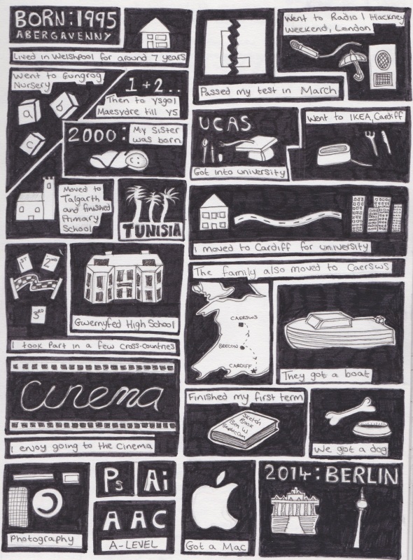 Here is a revisited version of my life story, after the class presentation I wanted to add in my education but overall in a new style. I chose to outline everything with a thick black border for emphasis on each event. To improve this I could add favourites and places I have travelled too. I could also add a significant event for each month over the year.
My concertina book
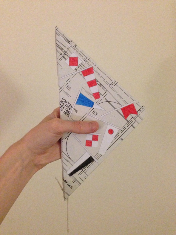
Posted: November 21, 2013 Filed under: Format, Subject, Term 1 | Tags: boat, book, booklet, concertina, horror, illustrations, mysterious, pencil, pocket, repeat, sea, ship, size, story, thriller, time, triangle Leave a comment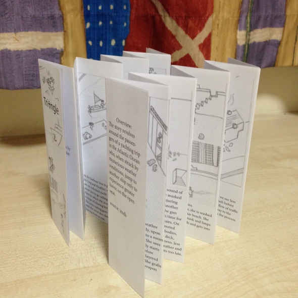
Here is my concertina book of the film Triangle. After completing this exercise I found that it was much harder than thought to fold the pages equally which took up a lot of time to get it correct. Once completed I feel that the final quality of the book lacks due to the grayscale format. I feel that the overview on the back page could be reformatted so the words are not split and I could also improve the images by illustrating them on Illustrator. This would provide a higher quality image and allow me to add a clean colour. The current version is still great due to its compact size and easy flow of text. I feel that the size of the text is perfect and the image size balances the block of text. This is also easy to reproduce as it only needs one A3 page. When reading the booklet, the way its created allows you to re-read from the beginning as the end runs into the beginning. To improve this I may use a higher quality paper or add a gloss finish. This will provide a sharper fold and increase durability. I will also add colour to the images and illustrate them accordingly. If you have any feedback please leave a comment!
Storybook Popout Crit
Posted: November 19, 2013 Filed under: Format, Subject, Term 1 | Tags: book, crit, graphics, hand, made, pop, story, triangle, up 2 Comments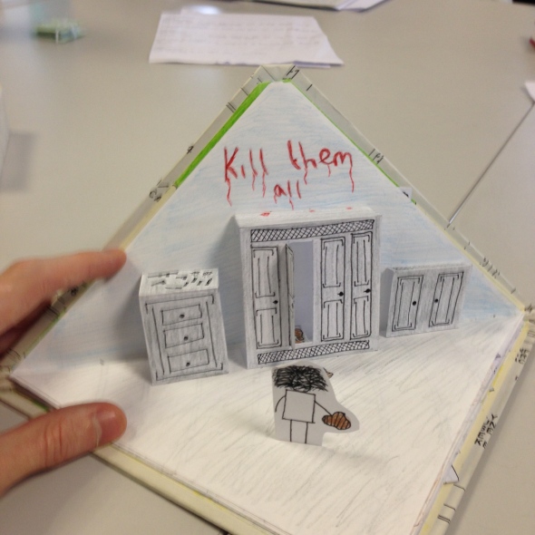
From my storybook crit I was able to get feedback from the other students. I learnt that many did not know the film Triangle and therefore a title would have been helpful. I also found that some liked the tissue papered sea and would of liked to have seen it carried on throughout the book. I think the pop out could be improved by using a more natural shaped book. This will allow me to extend my pop outs across the page without worrying about them sticking out on either side. Next we are going to digitally make our storybooks on Indesign. This will allow me to experiment with illustrator for each scene.

Recent Comments